Rivermen, Raiders Unveil New Logos
/
Peoria's new SPHL team reveals logo, uniforms
On Saturday, the latest incarnation of the Peoria Rivermen franchise — now a member of the Southern Professional Hockey League — officially unveiled its logo and uniforms.
 Peoria Rivermen new uniform designs (via Facebook)
I briefly went over the history of the Rivermen in Friday's post. The new look came just a day later via the club's new Facebook page, where they also posted the progression of Rivermen logos over the years.
 Rivermen logo progression, 1984—present (via Facebook)
The branding efforts are an attempt to capture history and tradition of the Rivermen franchise which has existed in some form for nearly 30 years. That's quite a run. For a deeper look, I recommend this article from Dave Eminian of the Peoria Journal Star. The write-up mentions that the logo and uniforms were designed by Carie Hanawalt.
The old Rivermen franchise of the AHL was recently purchased by the Vancouver Canucks and will no longer play in Peoria. So there will be a new name and a new location for the team at some point but nothing has been announced yet.

WHL's Prince Albert Raiders start "green movement"
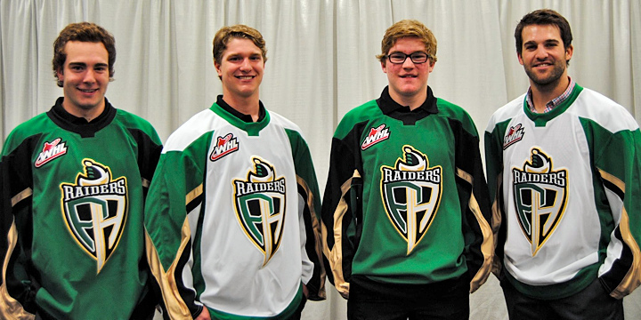
The other big logo unveiling last week happened in the Western Hockey League. The Prince Albert Raiders decided to highlight their green and introduce all new logos and uniforms.
 New jerseys modeled at Raiders unveiling (via Facebook)
Take a good look at those jerseys. They're Reebok Edge, but a brand new template we've ever seen. Factor in the colors, and what are the odds we're looking at the next Dallas Stars uniform with a different logo on the front? It was an IceHL GM, Mike Kelly, who first mentioned this via Twitter. And I have to agree.
Then again, it would be surprising for a couple of reasons. First, if Reebok is going to go out of its way to generate an entirely new sweater template, why would they do it for a junior league team. It's more likely that it'd be for an NHL club — like Dallas. But then if all that is true, why allow the junior team to hold its unveiling first — three weeks before the NHL club?
It could be a simple solution, like maybe Reebok works up new templates every year — some of which may or may not end up in use in the NHL. It could just be a way of expanding their own product line. In any case, it's something worth talking about.
What's your take? Both on the Raiders' new look as well as the possibility that they're a preview of the Stars' redesign. And how about the new Rivermen?
