New Look for Islanders by 2014?
/
There was a fascinating report in the New York Post last week. Apparently, the New York Islanders are looking into the possibility of a complete rebrand to accompany their move to Brooklyn in a couple years.
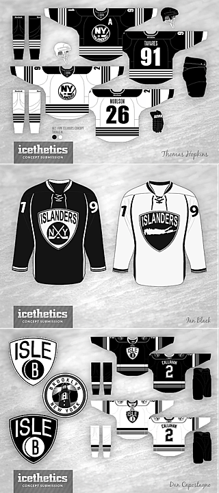
 Artist conceptsThe changes would include a brand new color scheme — and probably a new logo, though they aren't that far along in the process it seems.
The sports marketing brain trust at Barclays Center is weighing a change in the team’s royal blue, orange and white team colors, sources said.
Barclays Center, which will take over the business operations of the team when it moves from Nassau County as soon as 2014, is currently holding separate focus groups of Islanders fans and Brooklynites, sources added.
A member of one group told the Riverhead News-Review earlier this month he was asked to rate a new team jersey without any orange, one that looked like the old Brooklyn Dodgers uniform — blue and white.
The focus groups will be done in about 45 days — and then team owner Charles Wang will be updated, a source said.
You may recall that when the move to Brooklyn was announced last October, Wang said the branding of the club would not be changing. Guess this is one of those "never say never" things.
Also worth noting is that they previously announced the move to take place in time for the 2015-16 season. Now it's sounding like that could be moved up a year to 2014-15.
Barclays Center CEO Brett Yormark is leaning toward a recommendation that the team, which has the worst attendance in the National Hockey League, undergo a complete rebranding, the source said.
Yormark is encouraged by his efforts at rebranding of the Nets upon landing in Brooklyn from Newark. Team colors were changed to black and white. Attendance rose from a league-worst 13,961 to 17,187 per game, and jerseys, which hadn’t cracked the top 10 in popularity, finished No. 4 this past season.
Yormark ... said, “The colors black and white are the new badge of honor in Brooklyn. The question is, can we weave that into the [Islanders] color scheme, and create a connection to the fans here in Brooklyn?”
Of course the article points out that the organization isn't dying to grab Nets fans so much as keep their own existing Long Island fans.
What does all of this mean? Could those concept artists envisioning the Isles in black and white really have been on to something? What do you think?
