More on the L.A. Stadium Game
/
Taking another look at the new Kings, Ducks uniforms
It's been a bit slow around here lately. Not necessarily because there's nothing to report, but rather I've been a little busy away from the blog. While I try to make time to put together a few more posts this week, I wanted to look back at the Ducks/Kings Stadium Series jerseys.
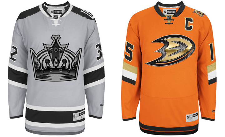
First, the images above are the official artwork from Reebok. They show the full jerseys, including the waist stripes (or lack thereof) which weren't visible in the images posted on the blog last week. The TEAM LA Store is currently taking pre-orders online if you're interested in buying.
I also wanted to do a bit of a link dump. Both the Ducks and Kings shared a lot of information related to these Stadium jerseys.
- Ducks' Stadium Series jersey press release
- Kings' Stadium Series jersey press release
- Kings' Stadium Series jersey: Q&A
- Kings' Stadium Series jersey: The Facts
If you're not interested in reading through all those articles, I've pulled a few fascinating facts below.
Stadium Series jerseys available in January
While you can currently pre-order any of the three unveiled Stadium Series jerseys, you can't take any of them home yet. According to the Ducks' press release, the jerseys will be available in stores and to ship in January. The Islanders' Stadium Series jersey order form, says "early January." No specific date has been made public yet — that I'm aware of.
Elongated numbers intended for fans in the cheap seats
The Kings' "The Facts" article explains the elongated numbers on the jerseys.
Player numbers on the back of the jersey are enlarged, making them more visible to fans in outdoor venues. Sleeve numbers are angled on five of the Stadium Series jerseys aligning player arm position with visual angles typical for fan viewing of the game in motion.
Honestly? I've never had a problem reading the sleeve numbers because of the angle. Let's just admit this is more about form than function. I guess the idea is that when the player is bent forward with arms outstretched to grip his stick, the angle of the numbers will be more horizontal. I have my doubts.
On the other hand, the elongated numbers make perfect sense now. There's so much real estate on the backs of jerseys that isn't being used. And because these stadiums weren't designed with a 200-foot hockey rink in mind, fans are forced to sit pretty far away from the action. The numbers can't be any wider, so making them taller makes sense.
The chrome crests use "high tech" printing
The chrome logos are cheesy but I suddenly understand the need. From the Kings' "The Facts":
This new technology fuses print and embroidery manufacturing process, allowing the logo to be displayed as a high-resolution image incorporated into the crest. This technology also reduces the weight of the crest, promoting a lighter jersey for improved athlete performance.
Ok, "weight of the crest" again? First the stripes weigh too much (San Jose!) and now it's the crests. Come on. But whatever it takes to make the players happy, right?
The first line of that quote is a crock. "Fuses print and embroidery"? No. Look at the photos. It's a printed crest stitched onto the jersey. Nothing about these crests are embroidered. And that explains the chrome logos. I'm guessing when Reebok experimented with printing crests, they realized it looked cheap.
So the logos required a little digital texture and beveling to give the same impression you get when looking at an embroidered crest. Unfortunately, however, it's probably a safe bet that printed crests are the way of the future when you take cost and player comfort into consideration.
The odd lace-up collar design explained
Once again, we'll turn to the Kings' "The Facts" piece:
The construction of the lace-up collar streamlines the cut and sew cosmetics of the collar for a seamless feel and better wear and performance, while still delivering the timeless style of the traditional hockey visual cue.
Now they're not even trying to hide their manipulation of us. It's just a "visual cue." But if we're being honest, the lace-up collars we see today are form over function anyway. They don't serve any purpose other than aesthetics. Which is fine.
I actually like the look of these new collars. They're just clean and unique.
Stadium Series jerseys were designed in 3 months
Teams usually spend a year or two developing new jersey designs. These were slapped together in just three months, according to Kings COO Kelly Cheeseman (a real name!). He was the focus of the Kings' "Q&A" article. He says the Kings' jersey design was a collaboration between the NHL's marketing department, Reebok, and the team's staff. (Note the lack of fan input. Not unusual, but the design seems to be going over well anyway.)
Feel free to weigh in on these new details in the comments.
