Seattle Arena Design Proposals
/
On Friday, the city of Seattle released three design proposals from 360 Architecture for the new arena to be built in the SoDo neighborhood. The building is being designed to house NHL and NBA games.
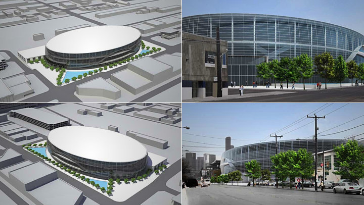
Option 1: Iconic and transparent
 Seattle Arena design proposal by 360 Architecture
The first option is a unique building with lots of exterior glass. It's very cool look that I think would fit into Seattle rather nicely. The designers tout it's "landmark, iconic form" while recognizing that the "highly transparent façade may create challenges with [the] Seattle Energy Code."
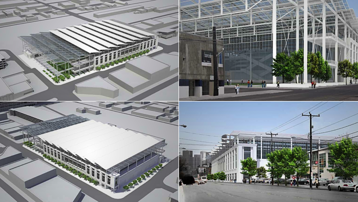
Option 2: Simple and efficient
 Seattle Arena design proposal by 360 Architecture
This design is a "cost effective building that maximizes function, architectural footprint, and street frontage," according to the architect. There isn't as much open space around the building as in the previous option, but maybe that's a good thing considering the weather around here during the hockey season. But aesthetically, this isn't my personal favorite.
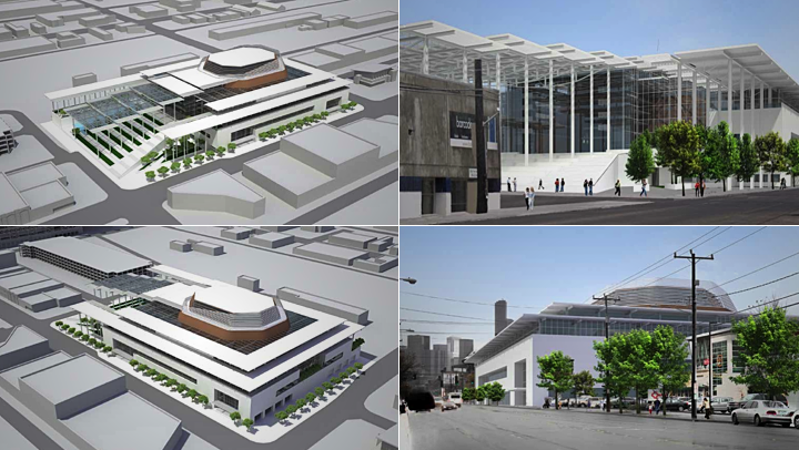
Option 3: Front porch to downtown (preferred)
 Seattle Arena design proposal by 360 Architecture
This final design was proposed as the "preferred option." Like the second one, it maximizes its architectural footprint, but it looks a little more modern. The entrance creates sort of a "front porch to downtown," according to the designer. However, it has a much "less iconic presence" than the first option.
I could certainly live with this design, but I think Option 1 is still my favorite. Then again, I'd be happy to walk into any building that has NHL hockey going on inside. Right now there's no city with that.
What do you think of these potential designs for the new Seattle Arena? Which one is your favorite? By the way, if you want to see the entire design proposal, there is a PDF available on the city's website.
