Blazers Aim for Modern-Retro Mix
/ Photos from Kamloops Blazers (via Facebook)
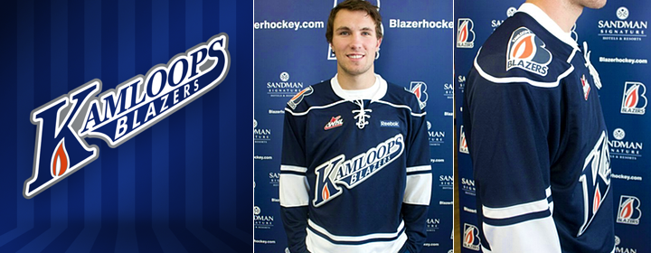
The string of great new WHL third jerseys continues with the Kamloops Blazers. The club debuted these new blue sweaters on Sept. 21 (and yes, I'm just now getting to them). And while they may look rather familiar, there's nothing wrong with that.
The looks is based on the fantastic green third jersey of the Minnesota Wild. From the script crest to the simple striping, it's hard to go wrong with a classic feel such as this. But that's not the only reason for the new alternate uniform.
Blazers director of sales and marketing, Dave Chyzowski, tells me that part of the reason for the new sweater was to give a little love to the city of Kamloops. And while that required a move away from the traditional Blazer "B," the new crest does include a variation of the primary logo to "give it that subtle flavour of the Blazers."
 Photos from Kamloops Blazers (via official website and Facebook page)
Chyzowski says the blue of this jersey is darker than the normal Blazers blue to help the new logo stand out. Basically, the team was looking to keep it simple and clean with a design that mixes retro and modern design elements. I'd say they succeeded.
Do you think the Blazers hit the mark with their new third jersey?
