Attack, Blaze Unveil New Looks
/A minor league and a junior league team have unveiled new identities for the 2011-12 season this week.
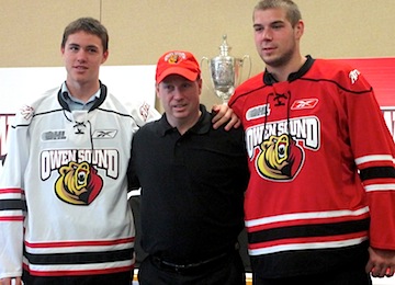
 On Wednesday afternoon, the OHL's Owen Sound Attack held a press conference to show off their updated logo and new uniforms.
The revised primary mark consists of a new text element plus a simplified version of the ferocious bear featured in the logo the Attack had used since 2000. The broken stick and the rest of the creature's hulking body have been discarded leaving us with just the growling head.
They're following the trend we've been seeing throughout hockey branding lately... simplify. They haven't gone out and rebranded from the ground up. They've merely removed the extraneous elements of the existing brand.
 Owen Sound Attack unveil new sweaters / AttackEven the jerseys are highly simplified — going for the Blackhawks-style stripes instead of the claw-shaped design that was previously featured.
The release on their website is poorly written, but includes this quote from forward Daniel Zweep:
“A bunch of us saw the new design halfway through last season and we loved it,” said Zweep. “It’s definitely a lot cleaner and more traditional. We can’t wait to throw them on and get back out on that ice.”
All right, something tells me that may not be a direct quote but I digress. For better or worse, traditional is indeed the trend of late.
Is the new logo an improvement? I'd call it more of a lateral move. The old one certainly had that late 90s look about it. This one just looks like any other simplified 90s logo. No better, no worse.
The only thing that bugs me about these jerseys is really a construct of the Reebok Edge template... that silly shoulder piping. If you're going to do the piping, it only makes sense for the shoulder yoke to be a different color. And even then, I'd do away with it.
You can read fan reaction to the new look on the Attack's Facebook page.
 In the minors, the Central Hockey League's Bloomington Blaze unveiled their logo and uniforms on Tuesday, just a couple weeks after announcing their existence.
The CHL welcomed the team from Bloomington, Ill. in mid-July as a replacement for the Bloomington PrairieThunder. The Blaze will have the same general manager, coach, arena, and probably players as the PrairieThunder. However, since there's new ownership, I'm not sure the Blaze continues the PrairieThunder lineage. It's a little confusing.
The Pantagraph, a central Illinois newspaper, reported the logo was designed by "Skye Design Studios in New England." And while a Google search turns up a variety of companies (and individuals) under that name, none seem to be based in New England. I'd be curious to see what other work they've done.
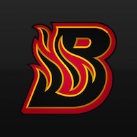
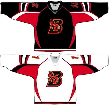
The black burning "B" is not a bad logo. Bold and simple; and it manages to avoid looking like the Calgary Flames for the most part. I kind of like it. But here's where things get interesting. The jerseys...
 CHL Bloomington Blaze jerseys / BlazeThis week we got our first look at the Ottawa Senators' new Heritage Jersey. We could finally put the crazy-striped third jersey out of our minds. And then the Blaze came along.
Indeed, that is the "SENS" jersey template you see there (right) with the new Blaze logo plastered on the front. That sweater will not die. I suppose the good news here is that we get to see what it would look like in white.
Guess it's time for a confession. I never really hated the Sens' third jersey. I just hated that it said "SENS" on the front instead of bearing, you know, an actual logo. It may be a little odd-looking, but you can't deny this is a killer jersey. And honestly, it seems to work with the Blaze logo.
So all in all, I don't truly have anything bad to say about the Blaze's identity. All I will say to their marketing people is this: Get your website up already! (Not that it matters anymore. The logo and jerseys have been documented now.)
If you're so inclined, you can find commentary on their logo and uniforms from fans on their Facebook page — their only online existence at the moment.
Between the Senators, Attack and Blaze, that's a lot of red and black this week. But there's going to be more. The Sens are holding a press conference to announce 20th anniversary details on Thursday afternoon. Maybe we'll get to see the new jersey in color? Or perhaps in a photograph? Stay tuned to Icethetics.
