Reworking NHL Uniforms II
/I'm sure many of your remember a new series we started last week from an artist under the moniker capn89. He's been redesigning the uniforms of each team league-wide, doing so without drastic changes to the colors or logos. It's been amazing work and while he began the series in alphabetical order, we're going to step out of that pattern for today's post.
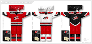
We're starting with the Hurricanes.
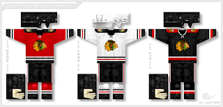
Again, he's only making slight adjustments, mainly to the striping and design patterns on the sweaters, but in some cases that can make all the difference. Next up, my personal favorite as you well know, the Blackhawks.
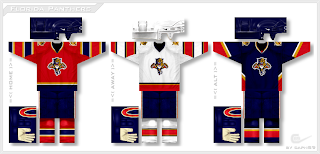
It's amazing how the addition of a shoulder yoke suddenly changes my mind completely about these uniforms. For some reason it even makes the logo look better! I might be going crazy though. Finally, we have the Panthers.
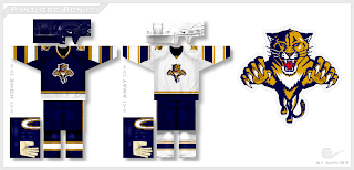
And just for good measure, he wanted to see what the Cats would look like without the red.
I'll keep these posts coming as long as he continues to submit his artwork. I expect to have a post tomorrow but with it being the 4th of July, I may be out so don't hold me to that.


