Rumored New Looks For Fall
/I ran across a post on the Canucks' official message board with some interesting information. It actually links back to NHLToL but that's not the interesting part. Apparently there's someone claiming to have had a look at new NHL logos for use this season. You can see the original thread here or catch the highlights below.
First of all, Boston, St. Louis, Nashville, and Florida have all changed to the same yellow Pantone color. The sharks also changed their teal. I think that is all for color changes.
Now for the more exciting stuff...
Boston: new wordmark in the same font as the B in the primary logo.
San Jose: Added a secondary logo with the letters SJ and the old unused shark fin logo from last year at the bottom.
Phoenix: Pretty much all new logos except for the primary, including a new full body coyote as a secondary.
Buffalo: Added a slightly redesigned version of the classic logo with the new navy blue. I looked at the two logos more closely together and it is pretty much the same with a Very minor tweak in the sword handle, and the addition of silver outlines around everything. It also has the red eye.
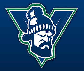
Vancouver: Added the Johnny Canuck logo with his head in the V back to their identity.
As with anything, I can't vouch for the information myself, but I read it and thought you guys might be interested — whether it ends up being true or not. However, my guess is most of it is on the level.
If I get any confirmations or looks at these logos, you can expect to see them posted right away.
Interestingly, but unrelated, in the same thread was an amazing concept logo I just had to post. You guys know how much I like the Canucks' new V logo. Well someone on that site created one that's even better! It's got a roughness and an edge to it that's lacking in the original logo.
I'm sure most of the Canucks fans here have already seen that, but to anyone who hasn't, what do you think?

