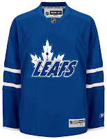
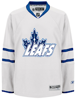
Maple Leaf Sweater Concepts
/Maple Leafs fans, yesterday I promised you some concept art and I'm making good on it. I've gotten half a dozen different jersey designs over the past few weeks and today I'm happy to share them with you.
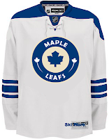
The first one here is a take on Minnesota's home sweater crest. It's cool even if it's somewhat unoriginal.
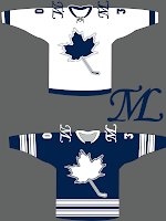
But if originality is what you're looking for, see the graphic on the right. It's probably a little too awkward to make for a solid design what with the unbalanced logo, no striping on the white and too much striping on the blue. But maybe I'm just being critical.
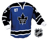
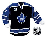
These two are cool if Toronto were to add black to the color scheme. But obviously as a Lightning fan I would be somewhat opposed to that.
And finally, on the current jersey design is an interesting logo I've been waiting to see someone make — the CN Tower in the veins of the leaf.
It's not perfect but how cool is that?
You know what tomorrow is. Yes indeed, another Freak Out Friday is nearly upon us. Stay tuned for that.

