The Blackhawks Saga
/If you've been reading my blog for any length of time, you're more than well aware of my aversion to the logo and uniforms of the Chicago Blackhawks. Now it's not that I just dislike them, it's that they're consistently billed as being the best logo/uniform combination in the NHL.
Yet no one has ever supplied a good reason!
I like their uniform design just find but I think their logo is old-fashioned — and not in the good way like the Canadiens. Even the Bruins had the sense to keep their look updated without kissing tradition goodbye.
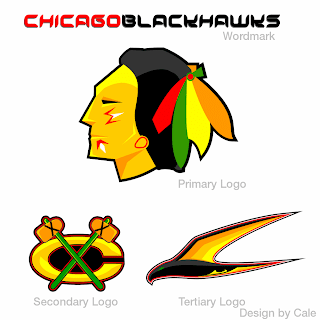
To that end, I got an email this past week with a great logo set I can't help but feel is an improvement.
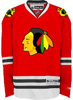
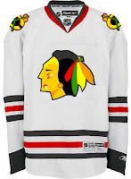
There are also jerseys — same design, just with the new logos.
Feel free to tell me I'm wrong and that the 'Hawks should change nothing, but know that I've heard it all before. And if you're among those who believe Chicago has the best look in the league, allow me to challenge you to explain. My position is that they are solid. They're not horrible, but how are they the best?
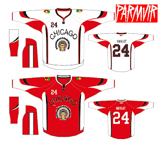
By the way, when redesigning the look of one of the league's oldest and most storied franchises, here's something to avoid.
Get ready. Monday's coming.


