Reworking NHL Uniforms
/There's another new artist I've received several submissions from but he's not looking to redesign team logos league-wide — just the uniforms. His sets include a home, road and alternate jersey for every club. On Sunday I posted his Ducks set (it's the first one in the post). But he's been working his way through the NHL alphabetically and I have a few more to share with you today.
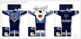
We'll begin with the Thrashers.
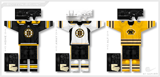
I have yet to see a design from him that I don't like. And that streak continues with the Bruins.
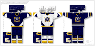
If you scroll down to the bottom of the post you'll see a bonus alternate sweater design. But first, the Sabres.
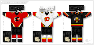
A very unique set here mixing old with new in terms of logo design — a rare example of the designer going with a completely new logo. The Flames are next.
In this design he reintroduces the horse head secondary logo (which I always liked) while keeping the jerseys mostly unchanged except for the striping patterns.
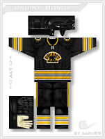
And finally, here's a look at that bonus Bruins alternate design.
It's basically a black version of the yellow one above.
I'm enjoying very much being able to post some outstanding work lately from some very talented artists. I look forward to being able to share more with you as ICETHETICS launches in just one week.

