Eastern Identities
/Just when you thought things couldn't get better, what with the Wallpaper Wednesdays kicking off today, I have concept logos. And some really great ones too. And since we did the West yesterday, today we're sticking to the East. Dare I say it, some of them even rise to level of Matt's work.
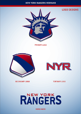
We're starting with the New York Rangers. And before you balk at the notion of rebranding a member of the Original Six, just give it a chance.
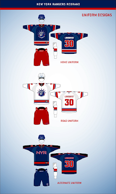
If you've been reading this blog a while, you know how much I love the Lady Liberty logo for the Rangers. Here are the uniforms to go with that logo set.
These work exceptionally well and I think that's hard to deny. Now I could go on and on about the quality of this artwork, but I'm more interested in reading what you guys have to say, so comment below.
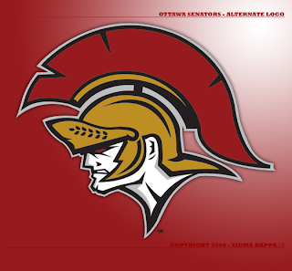
But first, let's move on to the Ottawa Senators.
It's like a Hulked up version of the new alternate logo. Scary. Very scary.
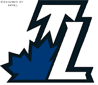
Got a couple more neat designs before I call it a night, including a secondary logo for the Toronto Maple Leafs.
Or who knows, maybe it would even work as a primary. But I'm smart enough to know you guys don't like messing with tradition.
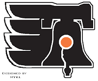
Then this here is just a Philadelphia Flyers logo incorporating the Liberty Bell.
So we begin and end with "liberty" today, apparently. Weird. Totally unintentional. Seriously though, drop us a line. I really want to read what you guys think of these logos, especially the Rangers. (Take a close look at that secondary mark.)
I hope to have more for you tomorrow.

