Dropping Into Carolina
/Today's concept art subject is the Carolina Hurricanes. Got a lot to share so I'll get started right away.
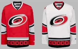
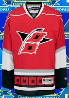
First up, a simplification of the current uniforms.
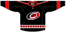
It basically drops some striping. Not much to speak of. There's also an idea for a black third jersey using the current primary logo.
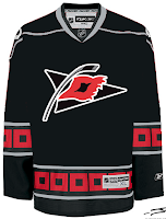
I like the triangular shoulder designs. However, a lot of the rumors we've heard suggest that the secondary logo will don the chest of a new alternate sweater.
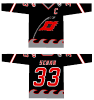
The one on the right is funny because of the waves. Reminds me of the Lightning's sole attempt at a third jersey in the mid-'90s.
But as many have pointed out, that flag is actually a tropical storm flag. It's simpler and therefore makes a more balanced logo. Technically, a hurricane flag would look like this.
What do you think of that secondary logo?
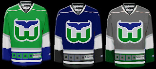
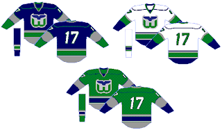
Now we'll go back in time a little to when the 'Canes were the Hartford Whalers. We've got some Rbk EDGE designs for them.
That's nice but I don't think the folks from Hartford will be able to identify well with the hurricane flags around the bottom.
Probably a better design there. I like that green jersey a lot. Thoughts on these? Post a comment.

