Odd, Unique Logo Designs
/Tonight's post is dedicated to those of you who've used your imagination to create entirely new logos for your favorite teams.
We begin in Anaheim with a neat logo design I featured earlier this month. Prepare yourself. It's very purple.
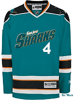
Next to it is a Sharks concept that probably should never been seen by anyone — ever. But I thought it could at least serve as just one more reason why teams should definitely not do this. I thought it was all right for the Stars as a one-of-a-kind sort of deal. But the all-star jerseys this year worried me.
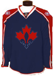
Moving on to Canada now, here's a Canadiens sweater with an interesting new secondary logo created by a reader some time ago.
It probably needs the fleur-de-lis in white, but otherwise it's a really cool, symbolic logo.
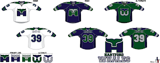
Now to Hartford, where someone has created a new brand for a team called the Whales. (Not to be confused with the Whalers despite the logos seen here.)
Those are some pretty snazzy jerseys. (Yes I said snazzy. What?) I like the "H" logo but the "W" logo is more effective with that hidden "H."
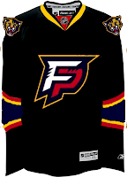
Next is a simply Panthers design.
I'm not really a fan of letter logos in cases like this. Put the "FP" on the shoulders and the panther head on the crest, that's what I say. But what does my opinion really matter?
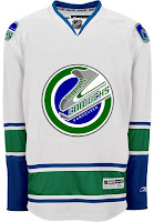
And finally — you know I've gotta do it — in preparation for my trip to Vancouver, here's a new logo design for the Canucks.
I hate to be mean, but I'll come right out and say I don't like it. Ever since I saw the new Johnny Canuck logo, I haven't been able to imagine another symbol that would work better for that club. Still, no idea's too dumb to put out there, right?
Don't forget to go cast a vote at ToHL for which CHL league goes first when the new tournament begins on March 14. And if you're wondering, I haven't yet decided what tournament will follow the Quest For The Worst here at NHLToL. I'll keep you posted.

