New York, New York
/I covered the New York Rangers in a concept post on Thursday so I thought I'd take care of the rest of the state this evening.
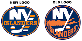
We begin with graphic I just received today, actually. It's a concept for making some adjustments to the Islanders' logo.
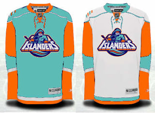
It's certainly cleaner but I don't care much for the oval shape. The circle is definitely the way to go. Anyway, here's something I probably should've included in yesterday's post.
So many horrible colors all touching each other.
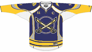
Now across the state to Buffalo. This is a Sabres jersey featuring actual sabers on the front.
We've seen stuff like this before, but never with such "unique" striping.
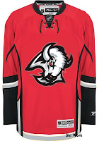
And obviously this just shows what you can do if you recolor a Flames jersey and drop the '90s Sabres logo on it.
By the way, the third round of the Quest for the Worst begins tomorrow. And I have finally updated the bracket to reflect second round match-ups.


