All-Star Duds
/With the Winter Classic and all its greatness now behind us, the next big NHL event is the All-Star Game set to take place in Atlanta in three-and-a-half weeks. Naturally, I have concept art, but before I get to that, I've got some real stuff to discuss.
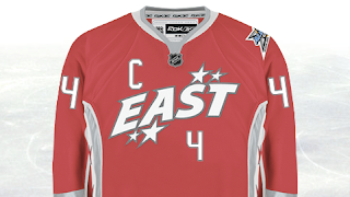
I've gotten a few emails recently that called to my attention the fact that I have yet to really talk about the new all-star uniforms here on the blog. I first posted photos of the new sweaters back in November. Since then, there have been other developments.
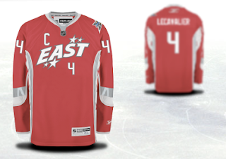
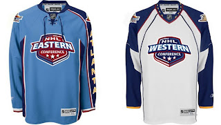
For instance, the reason the "logo" is so high up on the jersey is that the player's number will go below it on the chest.
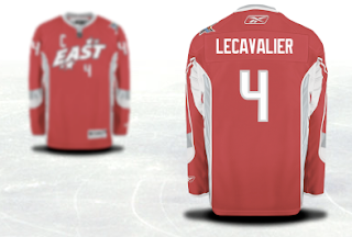
For a better look at the entire jersey, these images come from the NHL.com shop where you can customize and order an all-star jersey. Naturally, I used Vinny Lecavalier in my example.
You'll notice the captain's C takes its lead from the Detroit Red Wings in its right-shoulder placement. We can see that the all-star logo will go on top of the left shoulder while it would seem the player's team logo will go on the right.
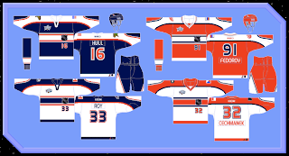
As far as creative all-star jerseys go, my personal favorite was what they wore in the 2001 All-Star Game in Denver.
I may have strange taste in uniform design by most standards, but wait until you see some of the concept art that's been sent to me.
Modeled after the host team itself is a jersey set that is actually quite cool. What if the league made a habit out of this?
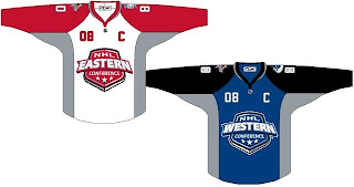
Here's a simple set that uses the conference logos as its primary features.
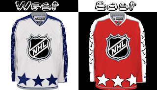
This set just has far too many stars on it.
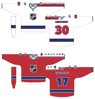
And this final set is a callback to the 2001 uniforms I just mentioned above where the goalies where a different color from the rest of the team — in essence, matching their opposition.
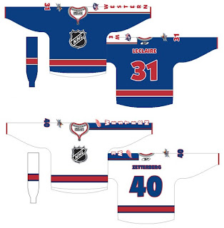
These too are modeled after the Atlanta Thrashers own uniforms, but a little less on the nose — trading the ATLANTA sleeves for EASTERN and WESTERN. It's a set I'm a big fan of.
Overall, some nice designs and some strange designs. I'm curious to read your reaction to these. Comment away.

