Boston, Buffalo Fan Art
/The polling in the Quest For The Worst tournament began this week with logos from the Buffalo Sabres and Boston Bruins. So, really, I should've posted this sooner. Luckily, there's no one to give me a bad grade for turning work in late.
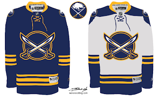
We've seen a lot like this recently, but this is just another really nice Sabres concept that makes use of my favorite logo as well as the favorite logo of a majority of the fans on this site.
But at least that buffalo is where he should be — the secondary position, the shoulder.
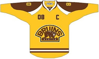
As for the Bruins, a lot of folks seem to be behind whole gold and brown notion. I'd have to see it on the ice to know whether I'd be a fan or not.
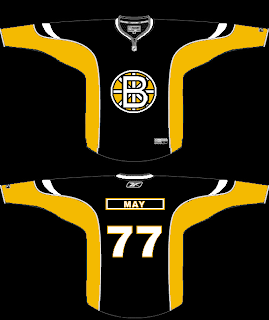
And then there's a scary logo alteration that should never see the light of day — don't take your computer outside.
That's that. I've got some good stuff for tomorrow's Freak Out post. Stay tuned.


