What If The Jets Were Still Here?
/Over the past week, I've been surprised at the number of concepts I've been sent featuring the Winnipeg Jets. Surprised because that team no longer exists. Still, all the work people put in made me think I should share some of what I received.
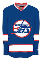 Here's what the Jets might look like in a new Rbk EDGE jersey. This concept is based off of the new Canucks jersey. Not bad at all.
But with all the modernizing of this league, I have a feeling the logo would be different today. The logo you see on this jersey has been around since 1990. Don't get me wrong, I think it's a great logo, but I just feel like it would've been changed somewhere along the way.
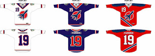
Maybe to something like this.
The diagonal stripe in the red jersey freaks me out a little bit. Too steep? The designer wanted me to let everyone know that the shoulder patch emanates from the city of Winnipeg's coat of arms. I know it's small, but it's there.
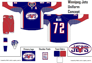
A different artists had a different idea for a new Jets logo and uniform set. It's also quite impressive.
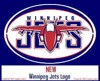 I wish I could tell you it was an original design, but it's based entirely off of the AHL's Houston Aeros' logo. I do like the jerseys, though. Not too much to complain about there. A simple and classic sort of feel.
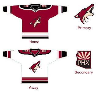
But despite all of this effort and toiling over Photoshop and Illustrator, the Winnipeg Jets moved to Phoenix in 1996 to become the Coyotes. So while I'm here, I also got emailed a great 'Yotes concept I can share.
One thing I don't like about the current Coyotes jerseys is the monochrome feel. Black is a big part of the logo so why doesn't it have any part of the uniform?
I like that a lot! Coyotes fans, do you have an opinion. Do you like these or are you more supportive of Wayne Gretzky's prescribed design which the team currently wears?

