Jersey Concept Art Galore
/Busy day today. Shame I'm only getting to my first post at 5 PM, but some days, that's the way it goes.
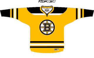
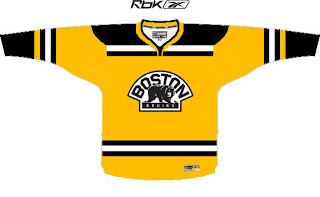
Always gotta kick things off with some good concepts. So let's dive in with the Boston Bruins.
I like these logos much better on a yellow jersey than the old bear head. Although, I say that now but to be fair, when it came out I thought it was pretty damn cool.
I also like the striping patterns on both jerseys. When the third jersey program is reinstated next fall, I hope the Bruins consider something like this. It's very sharp.
Then, one thing a lot of people have been contemplating is what the Atlanta Thrashers would look like if the road jersey matched the home jersey.
Perhaps it would look like this. That's really nice, if you ask me. I really love the asymmetry of that light blue jersey. The city down the arm looks great and it's so unique to this team. I'm really impressed and I only wish the Lightning had thought of it first.
One reader also emailed me a handful of concept designs. I wish I had larger images, but this is what was sent.
My favorite in that set is the Kings but I think the red Blue Jackets sweater is ironic and very sharp. Not a fan of the black Wings jersey and the blue Isles jersey reminds me of the Lightning's old black sweaters with the white along the shoulders.
Now it's time for your input. Let us know what you think in the comments below.


