Concepts For Logo Upgrades
/All right, if you've been reading for a long time (or even a short time), you probably know about my distaste for the logo many consider to be among the best in sports. That of the Chicago Blackhawks. I just don't see the allure.
You might find it surprising that I don't stand alone. In fact, in the past I've even posted changes folks have made to the logo. Well, I have another one. I still don't love it, but with a little work, I'd call it a big step in the right direction.
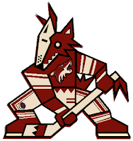
Then I thought this one was kind of funny. Not crazy enough to freak anybody out, but definitely different. Imagine the Phoenix Coyotes using both logos together with their current color scheme.
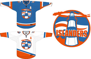
Okay so maybe it is a bit scary. What's not scary is this New York Islanders concept. I don't know. It just feels like such a special thing when you run into a concept this well-designed. Dump the text out of that logo and you've got yourself pure gold.
I like these jerseys so much. Even using the current logo on the shoulder is a great touch. Hell, I could even live with this lighthouse logo as a secondary. But I really do think the Isles should reintroduce something of this nature. I just feel like a lighthouse would make such a great logo for the Isles.
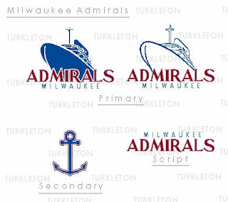
And finally, we go completely off topic here. This is a fan made logo redesign for the AHL's Milwaukee Admirals.
Thought it was pretty decent. It feels a little familiar to me, like I've seen it somewhere before. But that could just be my brain playing tricks.
What do you guys think? Feel free to drop a line in the comments.


