Sharks Unveil New Uniforms!
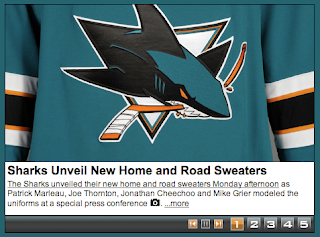
/The San Jose Sharks have become the final NHL team to unveil their new Rbk EDGE uniforms today.
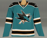
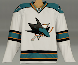
How about those! To echo some other folks, we're definitely looking at a fancy new logo on a very retro sweater. What surprised me was the shoulder logo.
I was expecting a fin logo so I was a little shocked to see the full shark logo. And I'm pretty sure the shield logo will make its way onto the pants, leaving the fin logo homeless. The logos I'm referencing can be found here if you're interested.
 That teal looks really great on these uniforms, by the way. What totally sells it for me is the orange. I know a lot of fans aren't too keen on it, but I think it brings a great new dimension to a look that in recent years had been kind of monochromatic.
The cool thing is that the stripes around the elbows and waist are reminiscent of the original uniforms from 1991 which had grey in place of orange. And who here doesn't love retro? You know you guys do.
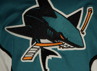
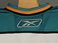
And then here's your close up of the collar. That teal looks really, really great.
Overall, I'm a fan. I think they could've gone with some more curvy lines and vertical piping to match, but they chose something a bit daring as far as these new Reebok sweaters. I'm impressed. I still prefer my Lightning jersey... which is coming in just a few days!

