Coyotes Unveil New Uniforms!
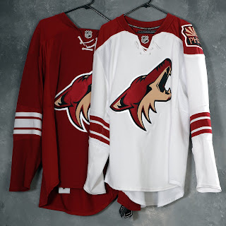
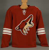
/At long last, the Phoenix Coyotes have updated their web site to indicate to us that their new Rbk EDGE uniforms have actually been unveiled. Behold the proof.
While no further photos have been posted to the site, I do have a few from the team's press packet so we'll consider them with this being the "official" post on the subject.
They're a little plain but I think that helps accent the logo. They're nowhere near the simplicity of the new Leafs' sweaters — which aren't helped any by the monochromatic logo. It's at least visually interesting to note that the shoulder patch is only on one side. As I pointed out earlier, it switched sides. No word yet on why.
It's a very clean and sharp uniform set and Coyotes fans should be thrilled.
UPDATE (9/16 7:50 AM): The Coyotes finally updated their web site late last night or early this morning with a great photo gallery from CoyotesFest. There were a couple of great action shots in there that really show off these uniforms.
They might be a little plain but they've got that old-time hockey feel and there's nothing wrong with that. One thing I never noticed before (since the Lightning almost never play the Coyotes) is the moon symbol from the original 1996 logo set has been retained on the pants.

