Just To Freak You Out, Part 4 of 5
/My week-long series meant to freak you out a little continues today. If you thought the last three days were something, just wait until you see what I have for you today.
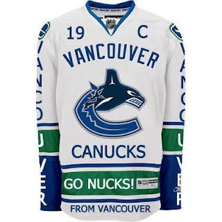
Canucks fans, a lot of you were unhappy with the new uniforms unveiled yesterday. But just remember. It could've been so much worse.
Told you. And what if they hadn't gone so far back to find vintage colors? What if they stopped in the '80s?
That's what.
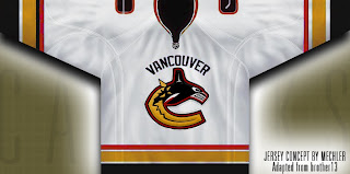
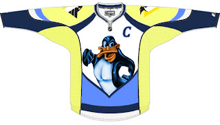
 Oh and I had to share this one. The Canucks seem to be all about mixing and matching. So here's what might've happened if they'd gone with this idea back in 1997 instead of the orca. A little scary but not horrible.
If you want to see horrible, imagine the Minnesota Wild in North Stars colors.
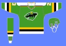 Try not to gouge your eyes out. It doesn't get any bigger for a reason. Quite frankly, I think the Wild have excellent colors. If you're among those who only see Christmas colors, I challenge you to find beige and yellow among the more common decorations. But that's neither here nor there.
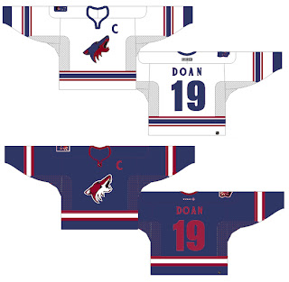
Moving right along. While we're on the topic of throwback colors, what if the Phoenix Coyotes had gone with Jets colors?
It's a rather frightening thought. You don't know what bad is until you see and red and blue howling coyote.
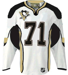
But I've saved the best for last, dear friends. My pals over at ThePensBlog.com came up with a good bit of satire that pokes some friendly jabs at the Reebok folks.
You may not realize at first glance, but that's the front of the jersey, not the back. I love the giant NHL logo at the bottom. If you want to see the number, there's the damn number. Crest be damned! But don't riot yet. You haven't seen the worst part.
Now you can riot.
Have a nice night. I'll be back tomorrow.

