Get Your Pittsburgh Fan Art
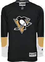
/I've got Pittsburgh Penguins concept jersey designs today. So get excited. This first set here is a recoloring of the newly unveiled Ottawa Senators sweaters.
 Continuing on this theme, though, someone recolored a mannequin donning that Sens jersey. Everyone seems to be concerned over the idea that Reebok has only created a handful of templates and that teams have had to choose between them. A color-by-number, if you will of the most ridiculous proportions. I don't see it that way though.
And those designs up there are rather plain. I think it works for the Sens, but not the Pens.
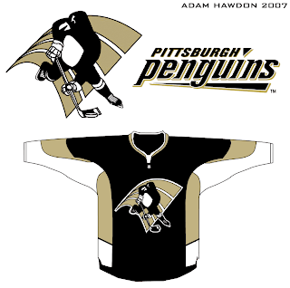
I also had something else rather unique emailed to me. Penguins fans, you know I've often talked about changing your logo — not that it necessarily needs to be. And right or wrong, you've shown that's not something you're at all interested in. But I thought this was interesting. Not sure it's better than what you have. In fact, the legs on the penguin make it look downright ridiculous.
You'll see what I mean.
Frightening stuff, right?
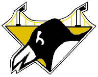
 Well, on top of everything, the '90s logo which still graces the shoulder of the current Pens jersey has been much maligned. But then somebody sent me this logo design that I thought would make a pretty solid secondary mark.
Any thoughts on that? Thought it was pretty cool. Then I've been known to be wrong at times, though. I'm curious to know what those from Pittsburgh think of this idea — as too is the designer, I'm sure. Leave your comments below.


