Just To Freak You Out, Part 2 of 5
/I'm back with more weird and wacky designs from the world of hockey art. Prepare yourself.
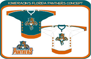
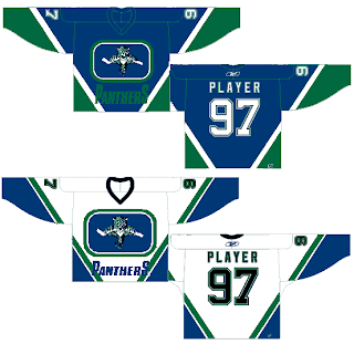
What sports franchise first comes to mind when you think Miami? The Dolphins, right? Well what made them famous? Was it their colors or the fact that football is one of the most popular sports in the U.S.? Well, the colors, obviously! So to help out the Florida Panthers in becoming more famous, one designer swapped out their colors. Take a look.
Go ahead. Rub your eyes. You aren't seeing things. Can you believe that? One incredible design after another, I tell you. Still, I can do better.
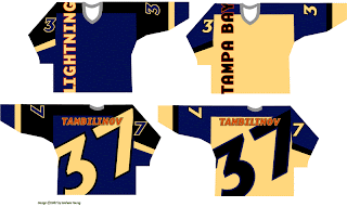
You'll have to look closely to tell, but that, my friends, is another fascinating concept for the Tampa Bay Lightning. No crest. Crazy numbers. The most original design I think I've ever seen. Here's my question: Can anybody Photoshop this jersey onto a picture of a player? Because I totally want to see how that bad boy looks on the ice.
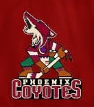 The Phoenix Coyotes had a great logo when for some reason they decided to throw it to the wolves in 2003. They dropped out what made their logo unique and colorful. Guess bland is back. Or not, so this designer thinks. Check that out. It's a wonderful combination of old and new.
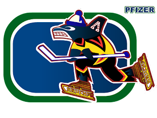
Kind of like this. And while we're on the subject of that crazy Canucks logo. What you really need to see is the fully-colored version.
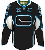
How can you improve upon something like that? It's like finding pure gold in the Black Hills. Oh, and while we're still on the topic of Vancouver — all you Canucks-haters — feast your peepers on these.
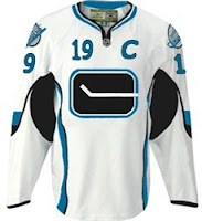
Yesterday we had black and neon green. Today we've got black and sky blue. If I haven't freaked you out enough yet today, just wait until you see this. I'm going to make this lousy post come full circle right before your very eyes. Behold.
From Panthers to Canucks. And I don't even have the words to describe it. No words would be worthy of describing it.
You'll tell your grandchildren this story. And you know it. Stay tuned. More is on its way tomorrow.

