Hey, Canada! Part 2
/My Canadian road trip today continues with some interesting artwork out of the province of Alberta. So as not to offend anyone, I'm flipping a coin. Heads, Oilers. Tails, Flames.
... flipping ...
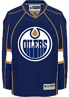
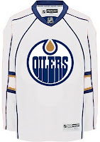
Heads. Okay, first up is the Edmonton Oilers. I was emailed these concepts based off of the new Florida Panthers uniforms.
It's all dark blue and copper here. But if what you seek is a revival of days gone by, I have a treat for you. WHA/Gretzky-era Oiler fans, eat your heart out.
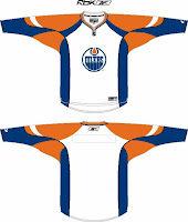 One reader emailed me this concept design based off of the all-star game template I posted in the sidebar. Not too shabby. Good ol' blue and orange.
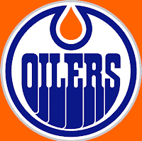
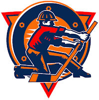
And remember the extremely orange fan creation I posted last week? I was sent a logo based on that concept. You can see it below along with a recolored version of the oilman logo — which we've heard is not long for this earth. The Oilers will likely go without a shoulder patch this season, but they also might get a completely new one. We'll just have to wait and see.
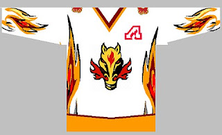
But that's not all. I also promised some fan-created artwork for the Calgary Flames. See that below.
That jersey is on fire! But like the oilman logo of the Oilers, this horse logo will likely become part of the Flames' history this summer. Word is a new secondary logo is on the horizon. With that in mind, let's look at an Rbk EDGE template.
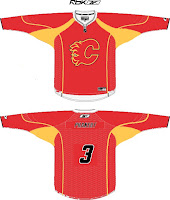 Very, very red. What is it with all the red anyway these days? That's the most popular color in the NHL. But I know, it's the Flames. Red is one of their obvious colors. All I'm saying, is that the black jersey might look good with a red flaming "C." In the alternative, a black flaming "C" would be the only way to go on a red jersey.
Any thoughts, Albertans? Please don't bicker. Lively back-and-forth, I can deal with. Resist the urge to pick on your fellow countrymen if you can.

