Sens, Sharks Uniform Fan Art
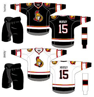
/We've seen the new logos (unofficially for one) but we've yet to see the new uniforms that go with them. So why not muse on the Ottawa Senators and San Jose Sharks briefly?
I like the red Senators jerseys a lot, but the black doesn't look half bad. Though in reality, odds are highly in favor of the Sens wearing the red at home this fall. The teaser pic on their web site seems to suggest that. Could be misleading, but I doubt it. I like the larger shoulder patch. More teams should do that. It looks really good.
The only problem I see with these two jerseys is the placement of the numbers on the sleeves. Way too low. Needs to be above the elbows. But wait! There's more!
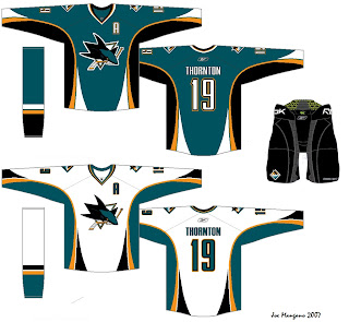
Consider these concepts for the San Jose Sharks.
They're pretty sharp, if you ask me. They could do a lot worse. The new logo looks very good on these. I'd like to see a bigger shoulder logo a la the previous Ottawa concepts. But otherwise I don't have a lot to complain about. Though from everything we've read and heard, I'd lean more towards expecting less curved lines and more straight lines. However, I'm not sure how well that would go with this logo. It's quite curvy.
Anyway, it all remains to be seen. The Sharks have yet to announce a date for unveiling their jersey, but the Sens have said August 22 will be their release date.
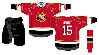
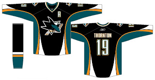
Before I leave you to your own devices for the evening, though, I have a couple of alternates from the same artists who came up with these designs. I know the NHL is dropping the third jersey program for this season, but we can dream, can't we?
Enjoy the rest of your night and don't forget to vote on the Senators-Rangers poll tomorrow morning!


