Blackhawks Fan Art For Your Viewing Pleasure
/I've got some Chicago Blackhawks concept designs to share. Let's dive right in.
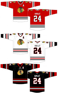
 Here's a set of 'Hawks jerseys in the new Rbk EDGE style. They're pretty sharp — and safe, as they're in keeping with the current design.
I like the black alternate jersey with the old logo. It's a rather nice set that I think most Blackhawks fans would have a hard time complaining about.
Personally, I've never been one to believe that Chicago has one of the best uniforms in sports (as is widely believed) and I don't think it would hurt if they went with a complete overhaul. And yes, I'm prepared to take the beating I've got coming to me for uttering such filth in an open forum.
Anyway, if someone can point out what features of this uniform make it so good, I'd be all ears. If not, then I don't know. Just enjoy these fan designs.
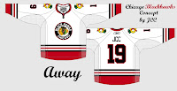
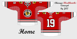
And these too.
 I think these designs are pretty cool, mixing the old with the new. The stripes are different, but not all bad. Would Blackhawks fans object to something along these lines?
What do you guys think? Am I full of shit about the Blackhawks logo? Is it really as good as everyone says? Would you like me to stop talking about it?

