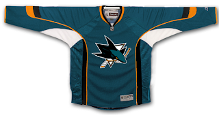
New Sharks Jersey Design Concept
/First thing: I don't want to go ten rounds with anybody over the fact that this is merely a recolored all-star jersey, so if that's all you were going to say, you can refrain. It's been said.
Now then. Today I have a fan-designed rendering of a jersey with the San Jose Sharks new logo. The purpose of this image to is to illustrate what the color scheme might look like now that they've dropped the gray in place of orange.
I really like this color scheme. Thoughts?

