HF&P, Part 10: Philadelphia Flyers
/I know, I'm a bad blogger, I promised this post yesterday, but I had a pretty nasty stomach virus that had me in bed all day. I know, no excuse. Now without further ado, "Hockey Fans & Photoshop" continues into the double digits with the Broadstreet Bullies.
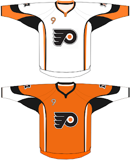
It's not a bad design. Rather simplistic when compared to some of the others we've seen. But I like it. I'd gotten used to the Flyers wearing black but I think a return to orange would be welcomed. Like others, this design also makes use of the front shoulder number on the jersey a la the Buffalo Sabres' new duds this season.
Now the coolest thing about this design is on the shoulders. Check out that secondary logo. I've always said the Liberty Bell would make a great secondary for the Flyers. I think it's really cool. I hope one day we can really see it on their uniforms.
Hope you enjoyed today's post in the HF&P series. It's been fun. And there's still so much more to come in the next 18 days before the tournament begins. How excited are you right now?!
Coming tomorrow: the Dallas Stars.

