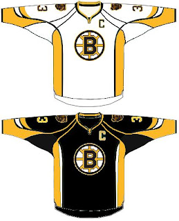
HF&P, Part 8: Boston Bruins
/Oh yes, there's more where that came from. The "Hockey Fans & Photoshop" series takes a look at another "Original Six" team that will transform itself for the fall of 2007.
Yes, the boys from Beantown may be looking a little something like this next season. Although, I have my doubts. Retail sources of mine are the impression that the Bruins will undergo some rather sweeping changes to its logo and uniform for the beginning of the Rbk EDGE era. But since I have no proof, this design isn't a bad thought.
The image quality isn't the best but it's a decent look. It keeps with the theory that Reebok would like the jerseys to be tucked in and therefore does away with the stripes across the waist, instead opting for vertical stripes up the sides. I don't hate it. But then I also don't love it.
I also find it strange that all of these fan-made designs keep the same striping and color layout as the all-star jerseys. I was under the impression those were just what they were. We'll see this summer, though, when teams start unveiling their uniforms.
And just as a reminder, none of the work here is my own so I can't take any credit. Various designers have been having a little fun with Photoshop in recent months and I just felt like gathering as much as I could find in one place. If you're a designer of any of these jerseys or others, don't hesitate to get in touch. You can design some exclusively for this blog or just write about your work if you want. We'd be happy to hear from you.
Coming tomorrow: the Calgary Flames.

