HF&P, Part 6: Ottawa Senators
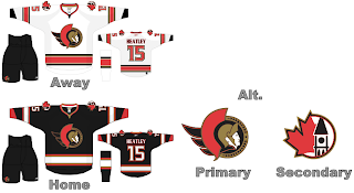
/The "Hockey Fans & Photoshop" trudges along, today with the Ottawa Senators fake new uniforms.
Actually, not bad. We appear to have a decent artist all over this conjecturing. I do like the use of the Peace Tower logo but what's with incorporating elements of your rival's emblem? Personally I prefer the more stylized Spartan head.
Yesterday, we talked about people taking issue with horizontal stripes mysteriously not working on the new Rbk EDGE jerseys. But look, it does. Oh my. I know there's special stretchy material on the sides and under the arms but that does inhibit dyes from working.
I like the lettering and numbering used in this design, but ultimately I'd like to see something different for Ottawa — not that this isn't a good idea. But there's nothing that exciting here. No sweeping changes like in other designs that I've posted.
In fact, if you want to see sweeping changes and fan artwork that will blow your mind, you definitely will want to come back tomorrow and get a glimpse of what some people think is coming for the Washington Capitals. We'll have lots of images and lots to say. Be sure to come back.

