Connected By Blue
/So what do all of tonight's jersey concepts have in common? The color blue. That's it.
We'll begin with the Buffalo Sabres and a design that despite its stripes is actually rather cool.
Yeah, the striping does ruin it though, doesn't it? I like the logos and the colors (though I'd go with a white circle on the blue jersey) but I don't really understand the weird stripes. In case you can't really make it out, the logo on the shoulders appears to be the buffalo from the original '70s logo sans the swords beneath it.
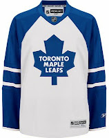
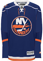
These two deal with some simple modifications. The white Leafs jersey with the blue stripes leaves me wondering whether this would be a home or away jersey. It seems to have too much blue to be a road sweater yet it has too much white to be for home games. The Isles jersey, however, is a nice adjustment. Not great. But better.
Here are a couple of dark Thrashers jerseys. Your pick as to which is home and with is an alternate.
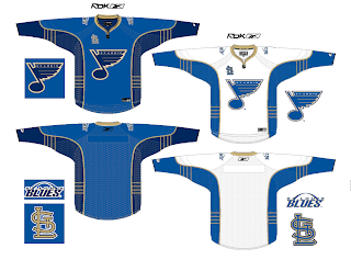
And finally, I promised a Blues fan I'd get this one posted tonight.
You know what to do now. Comment away. I'm interested in seeing what you guys have to say about these.


