Art From Music City
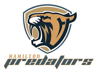
/Today's concept art is all about the Nashville Predators. Although you might not know it from where I'm starting. Remember all the noise that was stirred up over the summer regarding the possibility of the Preds being sold and relocated to Hamilton? It may be all but out of the question at this point but I've got some artwork that by itself may want to make folks reconsider.
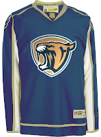
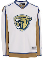
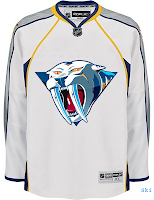
Ladies and gentlemen, the Hamilton Predators.
I have to say that this logo looks so professional that I might have to wonder whether it's been "borrowed." (Let me know if has.) But still, I can't help but love it. And although the jersey set is a recoloring of the Washington Capitals' threads, it's no less awesome looking.
I doubt I'm alone in that opinion. What do you guys think of this concept?
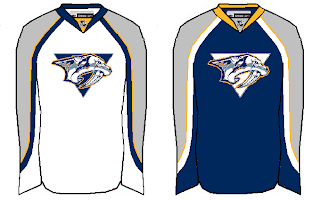
Anyway, we'll move on to some more conservative concept designs. These two really do nothing more than make adjustments to striping patterns. They're nothing special but they aren't terrible.
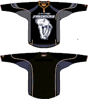
These next two are a little more unique and perhaps more worthy of an alternate jersey than a primary.
On the left we see the old third jersey logo on white instead of gold. Personally, I was always a fan of the gold jersey that critics have called "baby puke yellow." While I think that's funny, I don't think it's all that accurate.
The design on the right is the new fossil logo on black accented with dark blue. While this design isn't as neat as it could be, if cleaned up, I bet that would look like a killer sweater.
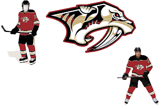
And finally, our last Nashville concept of the night basically deals with some altered colors. How about red and gold instead of blue and silver? It's not a common color combination in the league, but I definitely think there could be worse.
As always, feel free to leave your comments below. I enjoy getting feedback from you guys.

