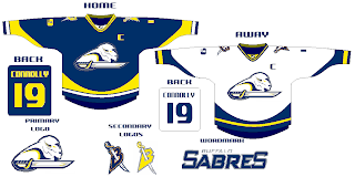
New Sabres Logo Concept
/Got some interesting artwork from a reader trying to redesign the Buffalo Sabres logo. Personally, I think John Slabyk has the perfect design which could never be improved upon — but then my opinion isn't the only one that matters. Shockingly.
Seriously, though, check this out and see what you think.
He even put it on a jersey for us.
Leave your comments as I'm sure he'd like to hear what you think.
UPDATE (5:14 PM): By the way, just so as not to confuse anyone, Slabyk did not design the logo posted here. This was sent in to me by a reader of the blog. Just wanted to clear that up.


