Some Simple Fixes
/Here's the post I was trying unsuccessfully to bring you yesterday. In going through all the concept art you folks have sent, I've found some interesting stuff. These are some simple ways of fixing the Canucks' and Maple Leafs' jerseys — both of which have been met with distaste from fans.
For the Vancouver Canucks, the biggest complaint seems to be the city name above the crest. This concept suggests removing that and simply reverting to the striping pattern of the old days — just with the new logos. I can't say I hate it. Though I figure myself as an oddball in all of this as I really like Vancouver's new sweaters.
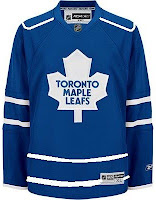
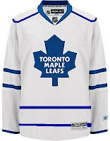
One new sweater set that struck me as a little too plain is that of the Toronto Maple Leafs. The lack of striping leaves us wanting more, I think.
This simple concept suggest striping at the waist and piping around the shoulders. While the shoulder piping has not impressed me much, I think it can work a jersey where not much is going on — perfect example.
I'd be curious to see what it would look like on the ice, but that curiosity will never be satisfied. In the meantime, we can only ponder what might have been and keep shouting our suggestions into the wind. Anyway, concepts are fun. What do you guys think of these?


