We're now a few days into the 2010 Winter Olympics and Canada and the United States are off to decent starts but the real test will be Sunday when they face each other. In the spirit of the games, a few artists have submitted related concept art.
 Jake Niehl Jake Niehl |
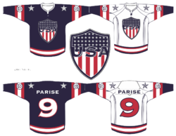
Jake has put together these sweater designs for Team USA. The shield is cool, if not reminiscent of the NFL shield. But I fear he hasn't fully thought through the size of his numbers. Double-digits would have a little trouble.
|
 Jeff Kennedy Jeff Kennedy |
And Jeff has sent in this Team Canada concept. It's not so much an original design as it is a fusion of a few different ideas. But mainly, he's dropped the black in favor of gold.
|
I'm really hoping to add more of an international flavor this post, so if you've got any ideas for ways to improve upon Finland, Russia, Sweden or anything like that, send it along and I'll include it here!
Update on 2010-02-19 05:36 by Chris

 Elias Cripotos Elias Cripotos |
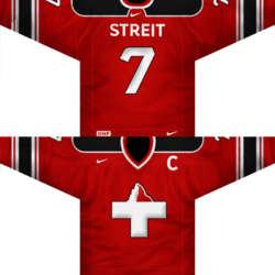
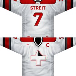
Adding a little bit of European flavor to this post, Elias sends in his Swiss redesign. Not only is it great by itself, but it's miles better than Switzerland's actual jerseys — which are very plain, as you know.
It's amazing what the addition of black does for the contrast on these sweaters, by the way.
|
Keep sending in your Olympic-themed concept art through the end of February!

