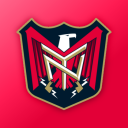
Poll: Detroit Motorheads


tdog

Craig C. Wheeler

Chris Smith

Click on a logo above to see the complete set to the right. Then vote for the best one below!

All sets include a primary, secondary and corporate mark. Some include an additional tertiary mark if provided by the designer. The identifier at the top of the image is the signature provided by the artist.

Note: The artist here named Chris Smith is NOT me.

Poll: Saskatoon Sharpshooters


Eddie Ray Design

Six Zero

Dave Delisle

Click on a logo above to see the complete set to the right. Then vote for the best one below!

All sets include a primary, secondary and corporate mark. Some include an additional tertiary mark if provided by the designer. The identifier at the top of the image is the signature provided by the artist.

FAQ: Unveiling IceHL Logos

Just wanted to answer some of the many questions I've been getting recently.

  • When are the IceHL logos being unveiled? Now. As each poll ends, I'm trying to get the team page launched within a day or two. (There was a delay this past weekend, but everything will catch up shortly.) Only Boston and Vancouver have been released so far. (Washington tomorrow.)
  • How will I know when a logo is unveiled? Twitter. It's right there in the sidebar so keep an eye on it. It's the quickest way to see what's new on Icethetics — the IceHL included. I update it several times a day. As soon as I launch a new team page, I'll link to it via Twitter and the original poll post as well.
  • Is there easy access to these team pages? Absolutely. This can also be found in the sidebar. It's visible below the IceJerseys.com ad on all IceHL pages.
  • How do you do get the embroidered effect on the logos? Tons of questions about this. I'm glad you guys like it. When I get some spare time, I'll put together a quick tutorial and post it on the site. (Pay attention to Twitter for that.)

If you've got more questions, please ask — either by email or comment.

Poll: North Carolina Nighthawks


Six Zero

Emilis Acus

Nick Matarese

Click on a logo above to see the complete set to the right. Then vote for the best one below!

All sets include a primary, secondary and corporate mark. Some include an additional tertiary mark if provided by the designer. The identifier at the top of the image is the signature provided by the artist.

Uniform Design Process

The next step in the IceHL project is practically upon us. And I'll try to keep this as brief as possible.

Today, the official logo of the Boston Colonials was unveiled on their team page. (All team pages will be accessible from the sidebar.) Eric Poole's logo designs snuck by with 38% the vote and will now represent this team.

Now that the Colonials have a logo, the next thing will be creating uniforms for them. It's going to mean running two parts of this project at the same time — logo voting and uniform submissions. To ease things on my end while we're still getting the logo voting underway, I won't begin taking submissions just yet.

We need to decide a couple of things as a group first. I'm hoping for your feedback in the comments in order to get some kind of consensus. Take a look at these bullet points and then weigh in below.

  • Jersey Format: Do we use the new Reebok Edge uniforms or stick with the traditional sweaters of the past? I can't decide and I'm open to going either way.
  • Uniform Design: Obviously, NHL templates for teams in the same geographical region should be off limits. Outside of that, what other restrictions might we need to put in place?
  • Uniform Template: We will need a template on which to build these jersey designs so that everything can be voted on uniformly. Point us to some of the better templates out there. Or maybe you've you designed one of your own that you think we should use.

If there's anything else I haven't thought of here, don't hesitate to ask. I'll take suggestions/questions both by comment below and by email.

Poll: Winnipeg Winterhawks


Six Zero

Pho3nix & Roccot

Craig C. Wheeler

Click on a logo above to see the complete set to the right. Then vote for the best one below!

All sets include a primary, secondary and corporate mark. Some include an additional tertiary mark if provided by the designer. The identifier at the top of the image is the signature provided by the artist.

Spotlight: Ogre39666

The IceHL Artist Spotlight series continues today, filling the gap when we don't have new polls. We're profiling the talented artists whose work is the subject of this project so you can get a better idea of who they are.

Selected at random, our second artist of the series is Steve Pace, working under the pseudonym Ogre39666. Steve submitted artwork for several IceHL teams and his persistence paid off when his Atlanta Arsenal logos, submitted on November 16, were deemed by readers to be among the Top 3 in a group of seven.
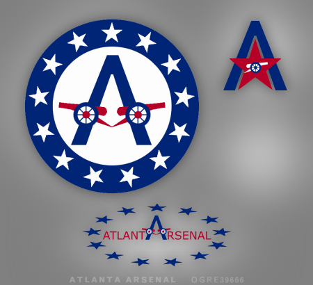
I asked Steve to tell us about how he came up with his finalist set. Here's what he told me.

I tried keeping things simple and a bit classic looking. For inspiration, I looked at the Georgia state flag, and decided that the colors and star motif could be nice elements to include in a logo.

Personally, when I hear the word "arsenal" I tend to think of cannon, which in profile, are simple, strong, and easily recognizable. So I decided to use it as the cross-member of the "A" and encircle it with stars Ñ simple-looking, but I think the simplicity gives it a classic feel.

For the secondary, I felt I had strong elements, so all that was needed was some re-arranging. Instead of using the cannon as the cross-member, this time I used a star with an inset cannon to reinforce it and since the points of the star and "A" matched up, it worked well.

For the wordmark, since Atlanta ends with "A" and Arsenal starts with "A", I decided to use just one between the words. This allowed me to use the "A" from the primary and bring some continuity to the set. The use of a single "A" also meant there would be six letters on each side so balance wouldn't be a problem.

If you have a question or comment for Steve, feel free to add it below. Approved comments will appear within 48 hours of submission.

You'll be able to vote on the final Atlanta Arsenal logo on August 28. Tomorrow, we kick off another week of polls with the Winnipeg Winterhawks. Next weekend, we'll look at two more artists in the Spotlight. 
Spotlight: Nick Matarese

The IceHL took the day off yesterday but it's back this weekend to kick off the Artist Spotlight series. This series will fill the gap on days when we don't have new polls, profiling the talented artists whose work is the subject of this project. The order of this series has been chosen at random.

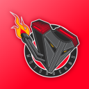
We begin with Nick Matarese, whose lone submission came to me on November 13 for the North Carolina Nighthawks of the Southeast Division. The following logos were rated by readers into the Top 3 of a class of 13 logos.

I asked Nick to talk about his artistic background and his inspiration for the Nighthawks logo. Here's what he had to say.

I am a graphic designer for Adidas. I graduated from the University of Delaware with a BFA in advertising/graphic design from the Visual Communications Department. While there I was also a four-year collegiate athlete with their ice hockey team (goalie) to which I am now an assistant coach.

I have designed other sports logos, including the Tatnall School's new hornet logo. I'm working on the Philadelphia Thunder (Junior A hockey team) and I redesigned the uniforms for the University of Delaware's ice hockey team — which the Long Island Gulls are also using as their third jersey this year.

Disappointingly, I got hooked onto Icethetics when the project was halfway over so I only had time to do logos for one team. When choosing the Nighthawks I wanted to design a logo in which the viewer was engulfed by the wings. I drew many designs and had research images of anything from birds to 3D models to X-Men characters to get the flow of the wings they way I wanted.

The tail and head were made as one with the body to give it an almost mythical feel, non-specific to any actual species (hence no feet). I liked having nothing but black and shades of grey to go with that dark mythical feel but it was missing something — that's where I added the lime green to make everything pop. For the secondary logo I wanted to make a profile of the beak and eye, yet still make an N.

mataresedesigns.com

If you have a question or comment for Nick, feel free to add it below. Approved comments will appear within 48 hours of submission.

The top three logos for the North Carolina Nighthawks go up for a vote this Tuesday. Tomorrow, the Spotlight will be on Ogre39666. New polls resume Monday with the Winnipeg Winterhawks.

Poll: New York Guardians


tdog

Roccot

Craig C. Wheeler

Click on a logo above to see the complete set to the right. Then vote for the best one below!

All sets include a primary, secondary and corporate mark. Some include an additional tertiary mark if provided by the designer. The identifier at the top of the image is the signature provided by the artist.

IceHL Artist Spotlight

Our IceHL logo voting schedule says we're taking today off. But no new poll doesn't mean no new content. This afternoon I wanted to mention the people behind the amazing logos you're voting on. After all, they didn't just happen out of thin air. Twenty-five amazing logo designers put their time and talents into this project.

Throughout the next six weeks of the voting process, you'll be hearing from many of these designers — from their educational and professional backgrounds to their inspirations for their IceHL logo designs. On days when we don't have new polls, expect to see an Artist Spotlight.

We'll profile the first artist on Friday but today I'm offering an overview the entire group. Artists will be listed along with their finalist logos. (A quick disclaimer before we start, the Chris Smith listed here is NOT me.)

CHRIS SMITH

Blue Crabs Colonials Cavalry Wave Outlaws Motorheads
Steelcats Hellcats Mammoths Gators Pioneers Armada
Barracudas Lumberjacks

SIX ZERO


CRAIG C. WHEELER


ROCCOT


TDOG


EDDIE RAY DESIGN

JOHN WRISTON

SEAN COX TATTOO

TONE LOC PRODUCTIONS

JFRED

JOEY LIGHT

SHAWN STEADMAN

ERIC POOLE

EMILIS ACUS

SIGMA KAPPA

DAVE DELISLE

OGRE39666

LLP

SOUTHPAW DESIGN

NICK MATARESE

JASON NEW ERA USHER

DAN STOVER

TROZ32

PAPLOO

PHO3NIX

All 25 artists have done incredible work to be here at this point in the project. But only a third of the logos you see above will actually represent IceHL teams come September. Voting picks up again tomorrow with the New York Guardians — one of the toughest choices you'll have to make over the next six weeks.

We'll take a break this weekend (my brother's getting married) but I hope to have some Artist Spotlights ready that will auto-post. Then it's back to the voting grind on Monday morning.