Rebranding Voting Results
It's clear from Week 2's poll results that the voters want to see a lot of changes to the IceHL this summer. So bring them on! What follows is an in-depth recap of the week.
Guardians, Mammoths will live on
Turns out the list of teams that will not be rebranded is shorter than the list of those that will. The New York Guardians will remain unchanged for the 2013-14 season based on a majority vote. And thanks to their (all but official) IceHL EAST championship, the Minnesota Mammoths will also dodge the rebranding bullet. (Championship teams are exempt, including the Huskies, Nighthawks and Beasts from previous seasons.)
Nine teams move toward rebranding
The other nine teams on the list will move forward. That may seem like a lot, but bear in mind that 1) the whole point of 13 Weeks of R&R was to redesign a bunch of IceHL teams, and 2) not all nine have to endure sweeping changes. So how will we move forward? That requires a more complex answer.
The IceHL Project has always been a living creative. I try to set some basic rules and then fine tune them as I see how voter feedback is looking. I'll explain what that means as we go on. First, the bullet points. Certain percentages will give us automatic changes.
Here's how that will work:
- The magic number here is 75%. Any team with more than 75% combined "yes" vote (adding "major" and "minor" answers together), will not be able to go back to their old logo. Any other team will have that option. (More on this below.)
- For any team that had more than 75% of its "yes" vote go for "major," a "full branding reboot" will be required. (Again, more on this below.) No team saw more than 75% of its "yes" vote go for "minor."
Option to revert back
This is a solution to a problem most designers are all too familiar with. Ever sat down to redesign something? You spend hours coming up with lots of different options only to realize none of them are better than what you started with.
In case this happens with 13 Weeks of R&R, I want to give IceHL voters the chance to hit the undo button. Without this option, we could end up in a situation where a team is designated for rebranding but none of the logo submissions are an improvement on the original. With so many talented artists expected to submit work, I doubt this will happen. But it could.
This option is an insurance policy against a collection of bad submissions. However, I set a cutoff of 75% because if that many people want "major changes," then the community as a whole must really dislike the existing identity and it will have to go.
Based on that 75% cutoff, this "undo" option will not apply to Dallas, Detroit, Hamilton and Saskatoon. For these four teams, a revision or full rebranding will be necessary.
The full branding reboot
As mentioned above, if 75% of a team's "yes" vote favors "major changes," it must undergo a full branding reboot. This number shows a large majority of voters wish to see sweeping changes, meaning the name, logo and even colors MUST change this summer. Not even a shadow of the former identity will be permitted.
Based on the 75% cutoff, this reset will apply only to Detroit. Other clubs will be allowed to keep their name, colors and/or logo depending on what the voters decide.
Rebranding: Team-by-team
Now the fun part. I've broken down the results for all nine teams that will continue in the rebranding process. Included with each is my opinion (as IceHL Commissioner) on how we might proceed. Feel free to agree or disagree by joining the conversation in the comments.
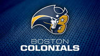 Boston Colonials
63% favor rebranding
46% of those prefer major changes
Commish Notes: The Colonials were toward the low end of the spectrum. It seems most voters want to see only minimal changes, and I'd agree. Perhaps just an update to the existing look would serve this team well.
Keep: This team has a great name and overall identity that we'd be wise to stick with. And the original logo designer has already submitted his revisions.
Change: Revising and modernizing the logo and uniforms may be all this team needs. But if you ask me, a color palette revision may be worth considering. This club is named after the group that gave birth to America and yet it's represented by blue and gold instead of the traditional red, white and blue.
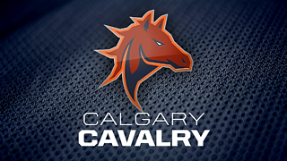 Calgary Cavalry
71% favor rebranding
64% of those prefer major changes
Commish Notes: The Cavalry have a great primary logo and a unique color scheme, but I can't say I'm surprised at the result. The name is rather silly even if the visual identity is a strong one. How cool would it be if we managed to rename the team in a way that would let us keep the logo?
Keep: The color palette is solid and seen almost nowhere in pro sports. The logo? I'm a fan.
Change: Honestly, the name needs to go which means an entirely new identity is likely in order. I'm happy to take the do-over if it means we can improve on the name.
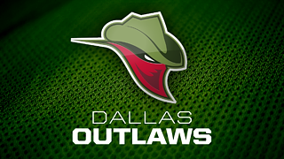 Dallas Outlaws
76% favor rebranding
66% of those prefer major changes
Commish Notes: The Outlaws were one of four teams to crack the 75% plateau, meaning we won't recognize them after the summer.
Keep: To be honest, there's very little I like with this franchise's identity and even less I'd like to see retained. Maybe we keep Dallas in the name, but other than that we really should start from scratch.
Change: Wholesale identity reboot, please. Even the name leaves room for improvement. And while we're at it, let's find new colors so we can more easily differentiate the two teams from Texas.
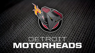 Detroit Motorheads
83% favor rebranding
79% of those prefer major changes
Commish Notes: This one caught me a little off guard. I never thought the Motorheads were that bad, but based on these results, it's clear this is the most disliked franchise in the IceHL. So let's start over.
Keep: The team has a palette unique to the league, but not one that's particularly special. Of course the 75% rule means that won't even be an option. We'll keep nothing.
Change: A callback to the original name of the IceHL project is in order. Let's rethink this one from the ground up. We might even reconsider whether to use Detroit in the new name. Perhaps Michigan or even "Motor City" could precede the nickname of this reimagined franchise.
 Hamilton Steelcats
77% favor rebranding
69% of those prefer major changes
Commish Notes: This franchise has a sordid identity history. Even from the beginning voters were torn over whether to name them for Toronto — the Hamilton Steelcats name just edged out the Toronto Tritons back in 2008. Now, with Toronto in the relocation conversation, the decision may be easier to make.
Keep: This club has always had a cool logo, even if it is a bit odd. And the colors are uncommon too. Things worth keeping in mind as we move forward.
Change: I've never been a big fan of the name Steelcats, especially given the Houston Hellcats' existence. Two "cats" is too many for a league whose commissioner is allergic to them.
 Montreal Olympiques
63% favor rebranding
63% of those prefer major changes
Commish Notes: Honestly, I'm not eager to lose this identity. It was on the list because, well, we needed 13 teams. My hope is that the Olympiques are around for years to come. I did not realize so many fans wished to see it go.
Keep: The name and logo are great! I'm only a little bothered by the color scheme but even that seems to work all right.
Change: If we do change anything, know in advance we won't be moving in any direction that's remotely similar to the NHL's Canadiens. Outside of that, I'm happy to explore new possibilities in Montreal.
 Saskatoon Sharpshooters
76% favor rebranding
74% of those prefer major changes
Commish Notes: I'm a bit disappointed by this one. It just feels like one of those classic hockey logos. But it's even more clever than the typical logo that incorporates hockey symbolism like sticks and pucks. This one uses the faceoff circle for crying out loud! And yet, the masses have spoken.
Keep: Well, not much. Even the super long name is probably going to go. And I was just learning to deal with all of its six syllables and 22 letters.
Change: Let's start over and let's make this Saskatchewan's team with the Regina Renegades packing up and moving this summer. New colors. New logos. And a brand new name.
 Vancouver Lumberjacks
67% favor rebranding
65% of those prefer major changes
Commish Notes: I'm with a lot of others in feeling like this team is just a jumble of existing Vancouver hockey teams along with a lazy name. Lumberjacks? We get it, there are burly men up here. But we can do better. We will do better.
Keep: The numbers aren't as overwhelming as with other teams, but there's very little I think is worth keeping here. The colors belong to the Canucks and the logo to the Giants, essentially.
Change: It might be time to start fresh with this B.C. team. I say we put our creativity to work and come up with a great new name and look for this franchise.
 Washington Sentinels
54% favor rebranding
51% of those prefer major changes
Commish Notes: As a group, we seem very much on the fence with this team. But the vote was just enough to put us in rebranding territory. So let's explore it. Personally, I wanted to see either the Sentinels or Guardians go because the identities were just to similar from the names to the color palettes. I'd like to see us begin anew in D.C.
Keep: It's hard to argue with red, white and blue for the team representing the capital city of the United States. Pro teams have tried other colors but always seem to come back to this classic palette.
Change: While I'd like to see a name change, voters seem hesitant to make sweeping changes. Perhaps a modernization of the logo and simplification of the colors would do the job.
That should do it. If you haven't already voted in this week's City Polls, what are you waiting for?