A Third in Tampa
/We're wrapping up our week of black third jerseys with Kevin Dion's take on the Lightning. It's a clever mix of old and new and probably would've been a better choice than the black BOLTS jersey unveiled over the summer.
We're wrapping up our week of black third jerseys with Kevin Dion's take on the Lightning. It's a clever mix of old and new and probably would've been a better choice than the black BOLTS jersey unveiled over the summer.


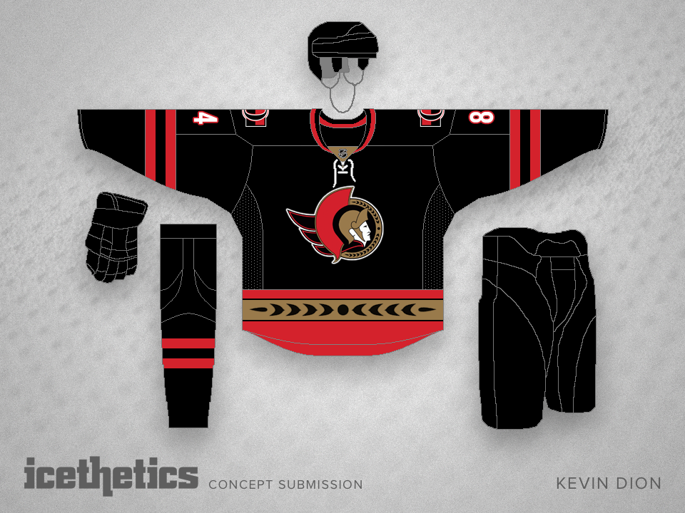
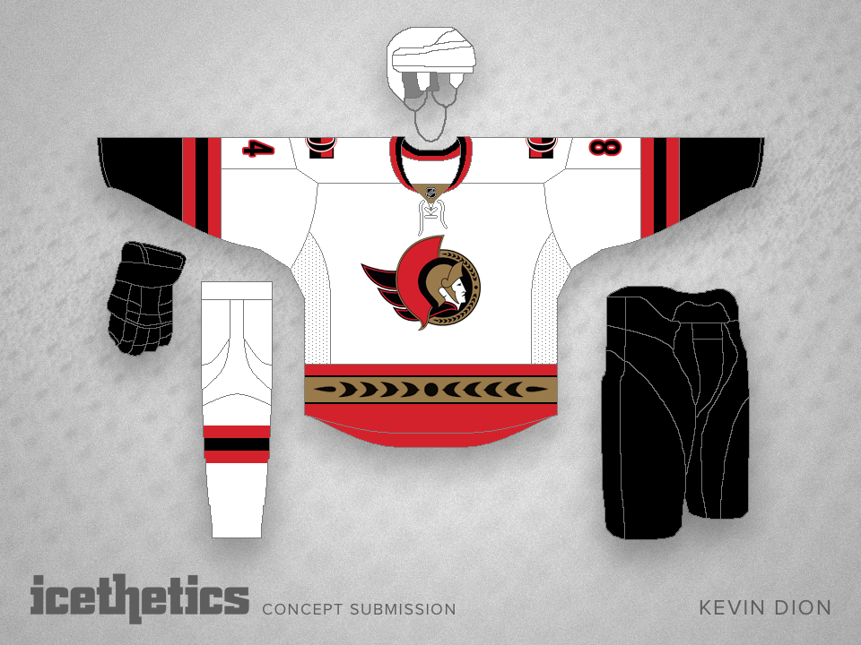
On Monday I mentioned the Avalanche are desperately in need of new uniforms. Perhaps even more in need are the Ottawa Senators. And the number of great Sens concepts coming lately is stunning, including this one from Kevin Dion. What are they waiting for?
If you're siding with those who think the Lightning's new third jersey could use some work, today's concept post is for you. Kevin Dion has a simple fix that tackles the prime complaints — the wordmark crest and too much black.
Meanwhile, we get concepts on back-to-back days from Tristan Mani, who actually put together this prediction last week. But it also works as a fix.
I like the blue sleeves on both jerseys, but the blue and silver waist stripes on Tristan's win it for me. Which of the two do you prefer?
Kevin Dion sent in this concept prior to the Coyotes announcing their name change. As an alternate jersey, it would fit much better with the team's existing home and road aesthetic. Plus, change "Phoenix" to "Arizona" and they could wear it this fall.
One of the best logos in Islanders history was jettisoned after just two years because it was paired with one of the worst. If we can all agree the fisherman was a mistake, at least let's recognize the lighthouse wasn't. It'd be great to see it again on an Isles jersey some day. Kevin Dion agrees. But is black the right color choice?