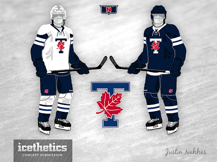
0288: Toronto Varsity Blues

It's Sunday so that means we get another college hockey concept. This one for the University of Toronto comes from Justin Nahhas. It's a pretty sharp look. The Varsity Blues' actual uniforms look a lot more like the Toronto Maple Leafs' by the way.

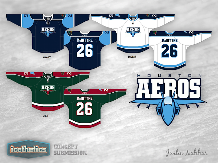
0248: War Planes & Purple Lions

AHL Week continues today with a pair of concepts by regular contributor Justin Nahhas. His Houston Aeros design are inspired by both parent club Minnesota Wild and the team's own short-lived former logo — a sort of modernized war plane. It's not bad but you can't really beat their current logo.


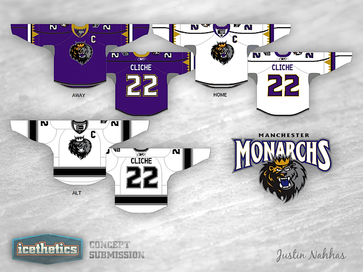
This Manchester Monarchs design also pays homage to the parent club, the Los Angeles Kings. Interestingly, their existing uniforms look a bit more like something from the Anaheim Ducks' closet. Think these are a step up?

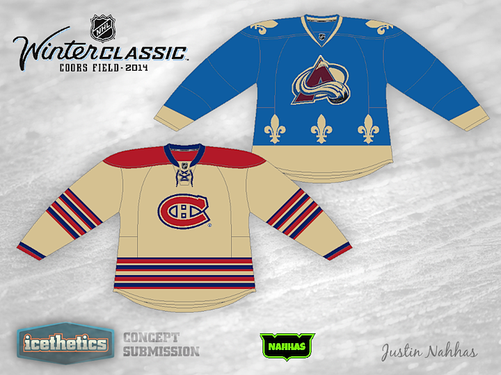
0182: Battle of Quebec 2014

This Winter Classic Saturday has Justin Nahhas imagining a possible Denver-hosted Classic in 2014. It's a play on the club's Quebec history as they would host their former rival, the Montreal Canadiens — who would be playing their third outdoor game in 11 years.

0159: The '70s in Milwaukee

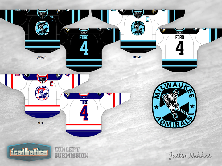
Minor League Week wraps up with a retro Milwaukee Admirals concept from Justin Nahhas. The logo used in this design dates back to 1973 when the Ads joined the United States Hockey League. By the way, this team has a lineage which goes all the way back to 1940. Fascinating to think how long some minor league franchises have been around even as we watch so many more come and go every season.

0156: Affiliate Swap

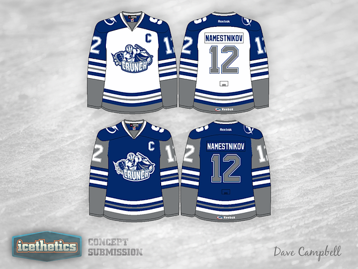
This summer the AHL's Syracuse Crunch and Norfolk Admirals swapped NHL affiliates. So that's our theme for today's concept post. First, Dave Campbell put together a pair of jerseys for the Crunch, who recently unveiled a new logo after announcing a new agreement with the Tampa Bay Lightning. These blue and grey sweaters could work really well!
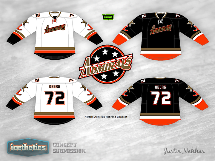
Meanwhile, the Admirals hooked up with the Anaheim Ducks in the aftermath. They've announced no intentions to redesign their logo or uniforms, but if they did, Justin Nahhas has a really neat look in mind. The only fault I can find is that the crest is almost unreadable. Could use a little more contrast. Otherwise, we have a couple of nice sets today.