0185: Quebec Revisited
/
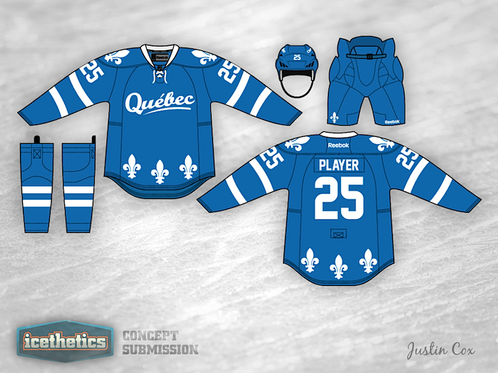
This week we're looking at concepts for teams that have disappeared from the NHL over the years. Today, Justin Cox brings us a new take on the Quebec Nordiques.

This week we're looking at concepts for teams that have disappeared from the NHL over the years. Today, Justin Cox brings us a new take on the Quebec Nordiques.
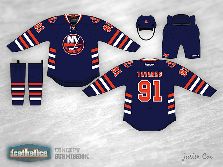
I think this is a very cool and inventive New York Islanders concept by Justin Cox. We haven't seen one quite like this before. I like the stripes but the biggest problem I foresee is in the striping itself. These groups of four stripes were created on a patch for a purpose — to celebrate the club's four Stanley Cups. So what happens if they win another? Change the uniform again? That could get old if the team ever got good. Regardless, I like the anchor. Seems like anchors and lighthouses would be great symbolism for the Isles but they just don't seem to be interested.
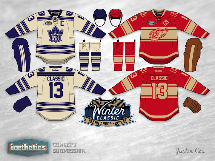
It occurs to me we haven't had a Winter Classic Weekend in quite a while. I'm bringing that back today. It also occurs to me that we still haven't seen an actual 2013 Winter Classic logo yet! Justin Cox is happy to provide both for us today. He's created a beautiful set of uniforms along with an impressive logo. Overall, one of the better concepts I've seen in quite some time!
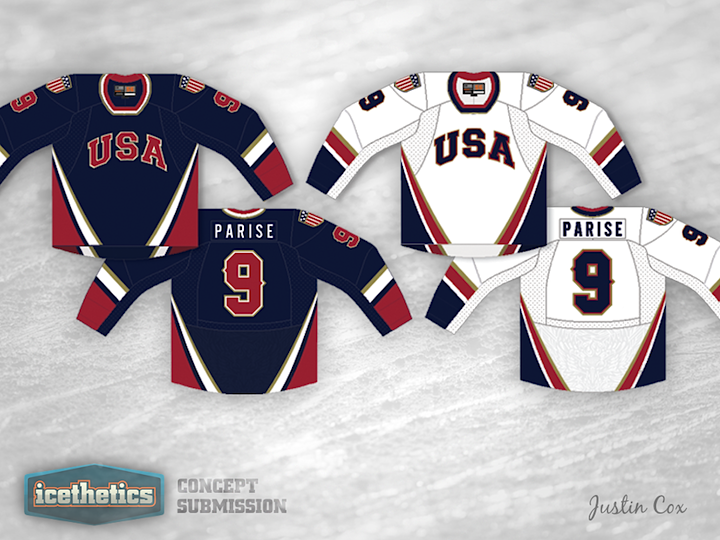
We get a double dose of national team concepts today — both for Team USA. Justin Cox incorporates some subtle gold into his design. A subtle hint to the wearer, perhaps?
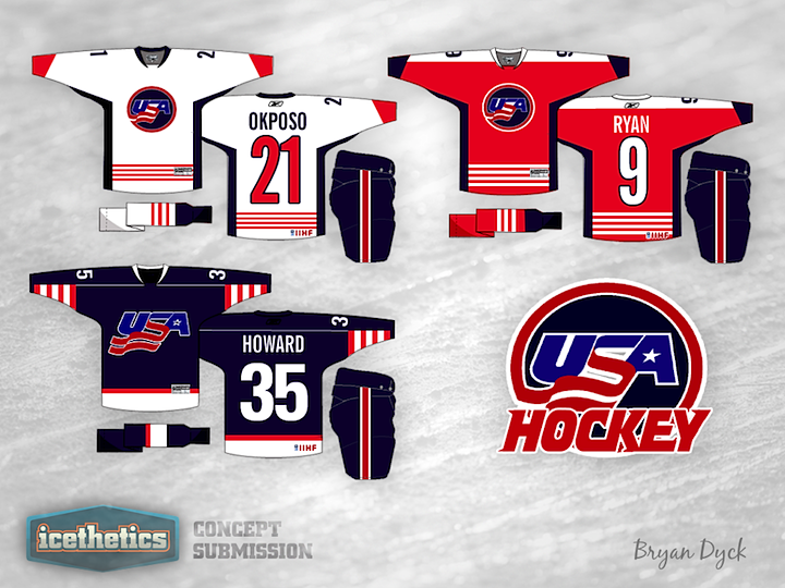
Bryan Dyck's work may lack the polish of other designs we've seen, but there's no mistaking this set is all American.

If this logo looks familiar, you've probably seen it before. It was registered with the U.S. Patent & Trademark Office back in 2001. In 2002, the Capitals swapped their primary and secondary logos as opposed to creating an entirely new identity. Still, the logo's been floating around out there over the years and Justin Cox has put it to use in this concept. I think it would make a great third!