Rechromed

Long before the first Stadium Series made it "cool" to have a chrome logo, the Philadelphia Flyers were doing it in 2002. It was not received well, but John Elbertson thinks it could be saved.

I paired the Flyers' chrome logo with my personal favorite template, and threw in some Oklahoma State gray pants for good measure. Maybe they can wear this for their upcoming chrome anniversary. I forget what year chrome is though.

My next idea involves fixing the Buffaslug, another reviled aesthetic that I actually liked. Might take a while though.

It Just Makes Sens

Following yesterday's Senators news, I thought I'd showcase another epic Ottawa concept, this time from John Elbertson. It would just be so easy to improve their look. So easy.

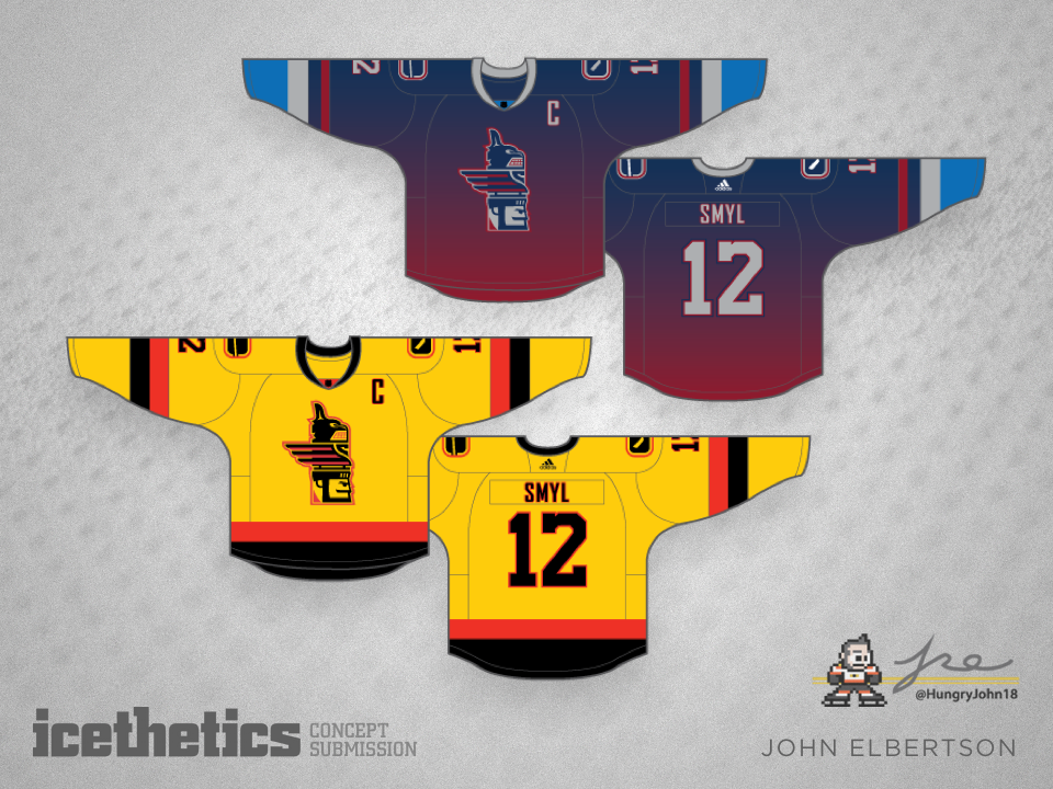
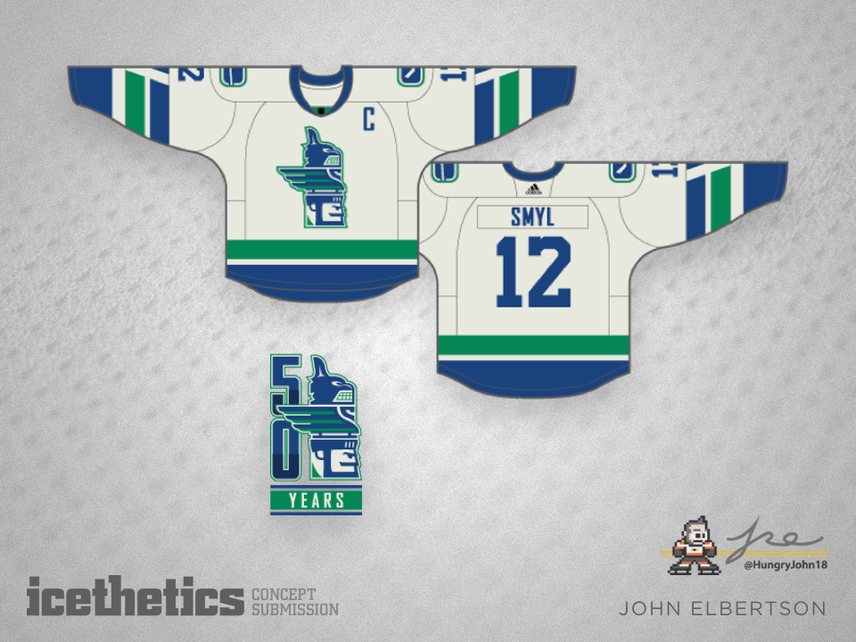
Canucks at 50

The Vancouver Canucks are a few years away from their 50th anniversary, but John Elbertson isn't wasting any time. He's come up with a clever totem pole concept to incorporate all various logo and jersey designs from club history.

Orange Isles

There are two things about the Islanders' 1995 redesign that actually worked — the lighthouse logo, and yes, the teal. It looks good with orange and navy blue! Anyway, John Elbertson has taken both of those things and created the third jersey the Isles should be wearing right now instead of that black monstrosity.

Past Ducks Remade

Back in the late '90s the Mighty Ducks had a pair of alternate jerseys with a unique striping style. John Elbertson is resurrecting that look with today's concept.