Stadium Series Midwest
/This week's Outdoor Saturday post features a potential 2015 Stadium Series concept by John Elbertson. He pits the Blue Jackets against the Blackhawks for another game without any white sweaters.

This week's Outdoor Saturday post features a potential 2015 Stadium Series concept by John Elbertson. He pits the Blue Jackets against the Blackhawks for another game without any white sweaters.
The most common Winter Classic rumors these days have the Capitals hosting the Flyers in 2015. To that end, John Elbertson shares his unique take. A two-tone blue jersey for the Caps? Seems unlikely given the nature of the Winter Classic, but it certainly makes for a cool concept, doesn't it?
The prolific John Elbertson recently submitted a Colorado Avalanche concept that caught my eye. He managed to create a complete three-jersey set without relying on white. It's a neat look and it makes me long for a return to that classic striping pattern.
John made some updates. Be sure to click on the graphic to jump to the next one.
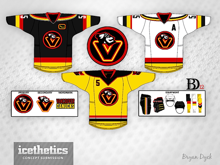
Tampa/Vancouver Week wraps up with a Vancity freak out. Bryan Dyck is merging the Canucks' 1980s color palette with their new Johnny Canuck logo. It's pretty clever but I'm not sure I'd want to see it anywhere outside the Concepts page. (Note the yellow socks!)
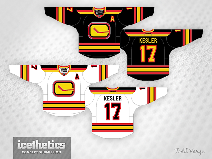
See a pattern forming here? Todd Varga added the 1980s palette to the stick-in-rink logo. Again, makes for a neat jersey set, but probably not one we'd want to see on the ice anytime soon.
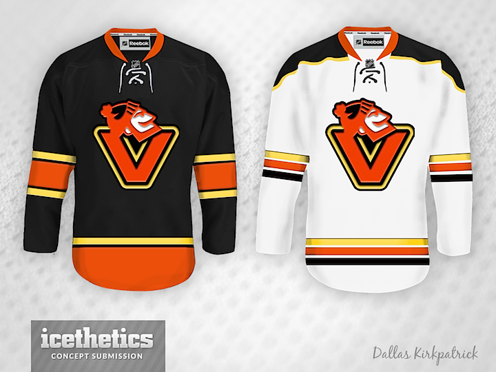
Newcomer Dallas Kirkpatrick is just scaring me now.
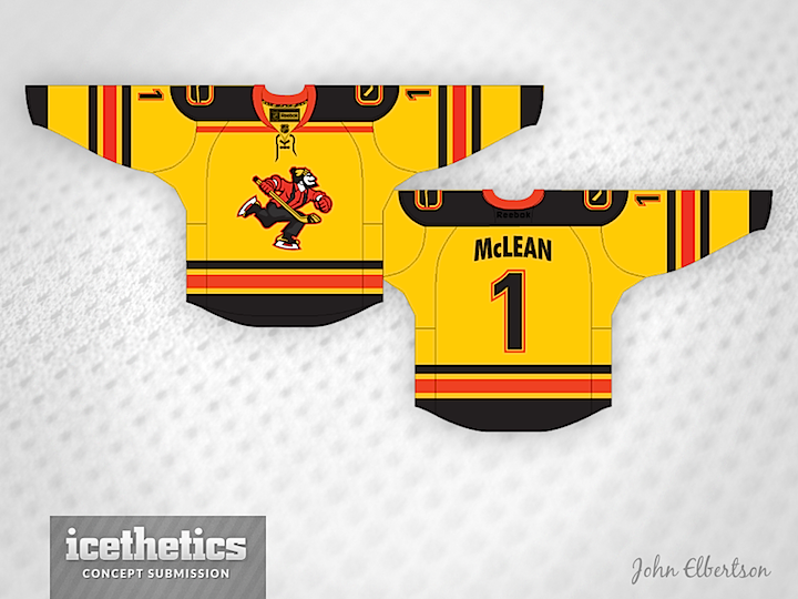
And finally, I was saving this one. Remember yesterday's Johnny Canuck set from John Elbertson? He included this yellow one as well but it fit so much better with today's theme.
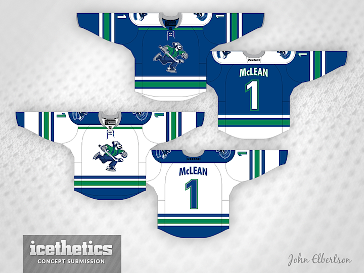
As Tampa/Vancouver Week winds down, we continue to explore the Canucks' ongoing identity crisis. On Tuesday, the stick-in-the-rink logo was featured. Today, the star is Johnny Canuck. John Elbertson created this set with a home, road and retro-inspired alternate jersey.
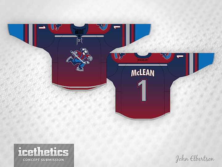
Now how about in green?
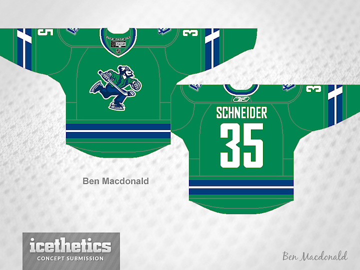
Ben Macdonald's contribution would actually fit in quite nicely with John's home and road set. And that Johnny Canuck logo really stands out well on green.
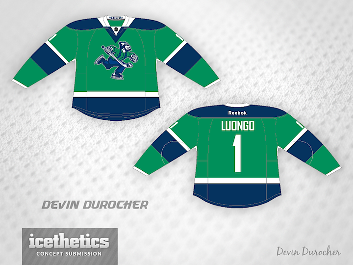
Devin Durocher also went with green but I thought his overall feel was different enough from Ben's to warrant posting them together. Do you have a preference? Would you like to see Johnny Canuck on the chest of a Vancouver player someday?
By the way, is there a reason why everyone who designed a Johnny Canuck jersey put a goalie's name and number on the back? Weird, right?