Freaky Grey Bolts
/It's freaky, yes, but it just might work... Chris Fortier imagines a grey third jersey for the Tampa Bay Lightning and an alternate treatment for their BOLTS crest. Happy Friday!
It's freaky, yes, but it just might work... Chris Fortier imagines a grey third jersey for the Tampa Bay Lightning and an alternate treatment for their BOLTS crest. Happy Friday!


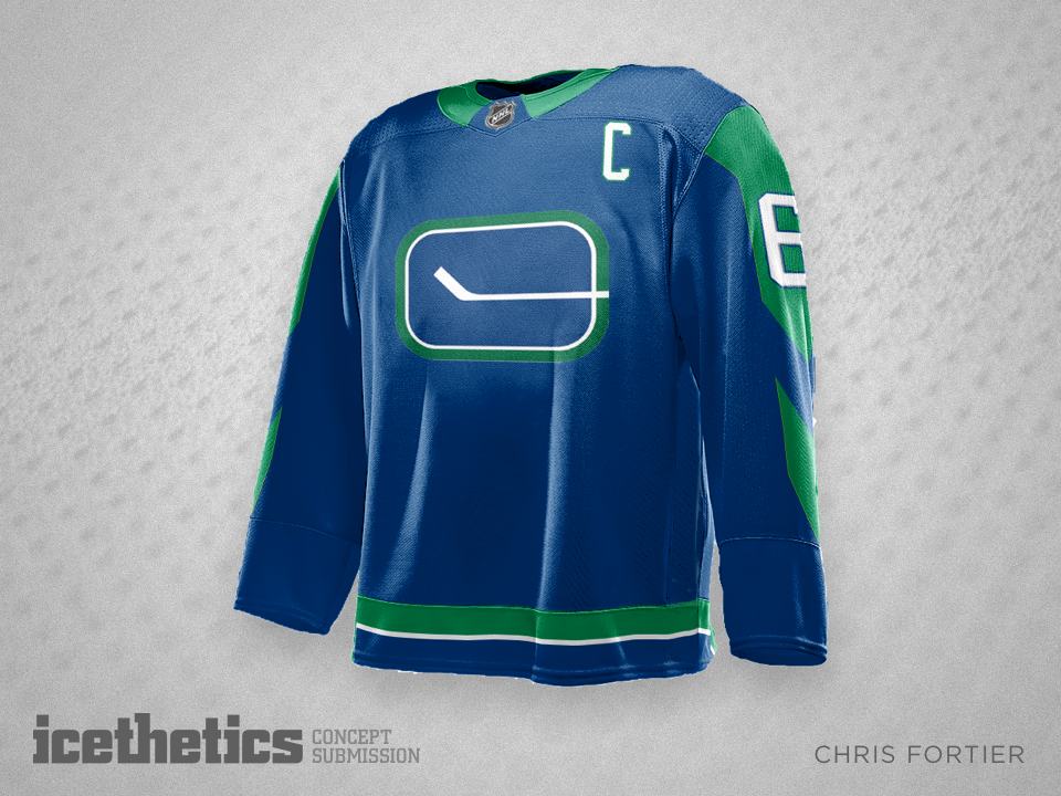
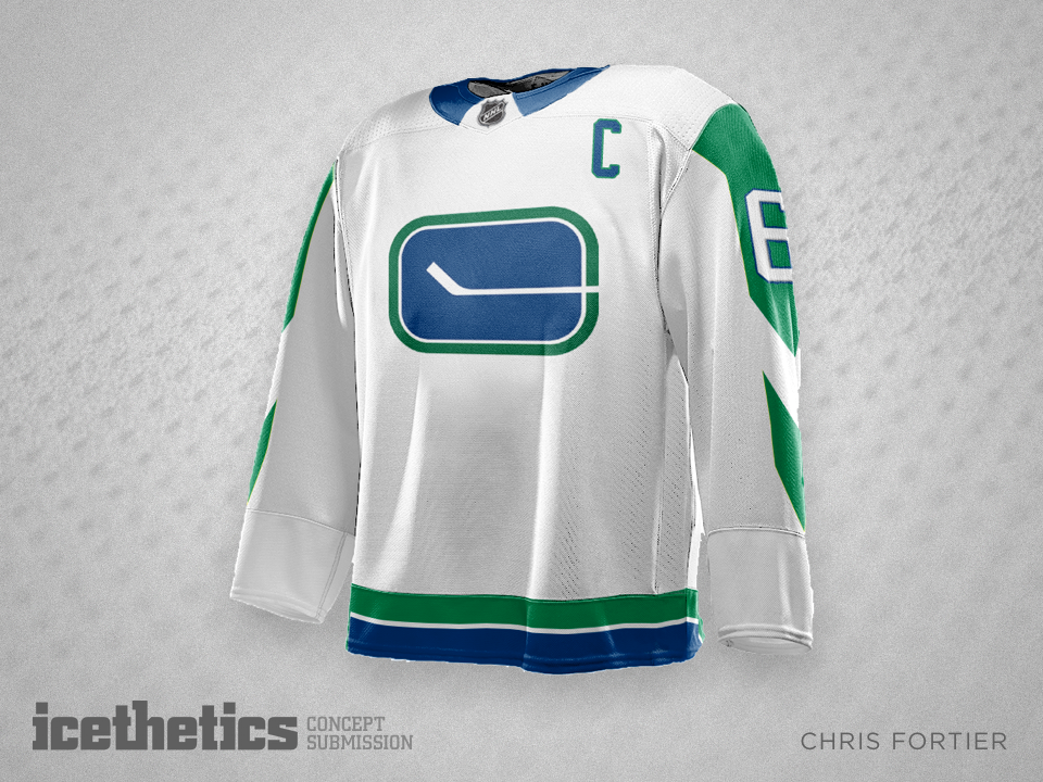
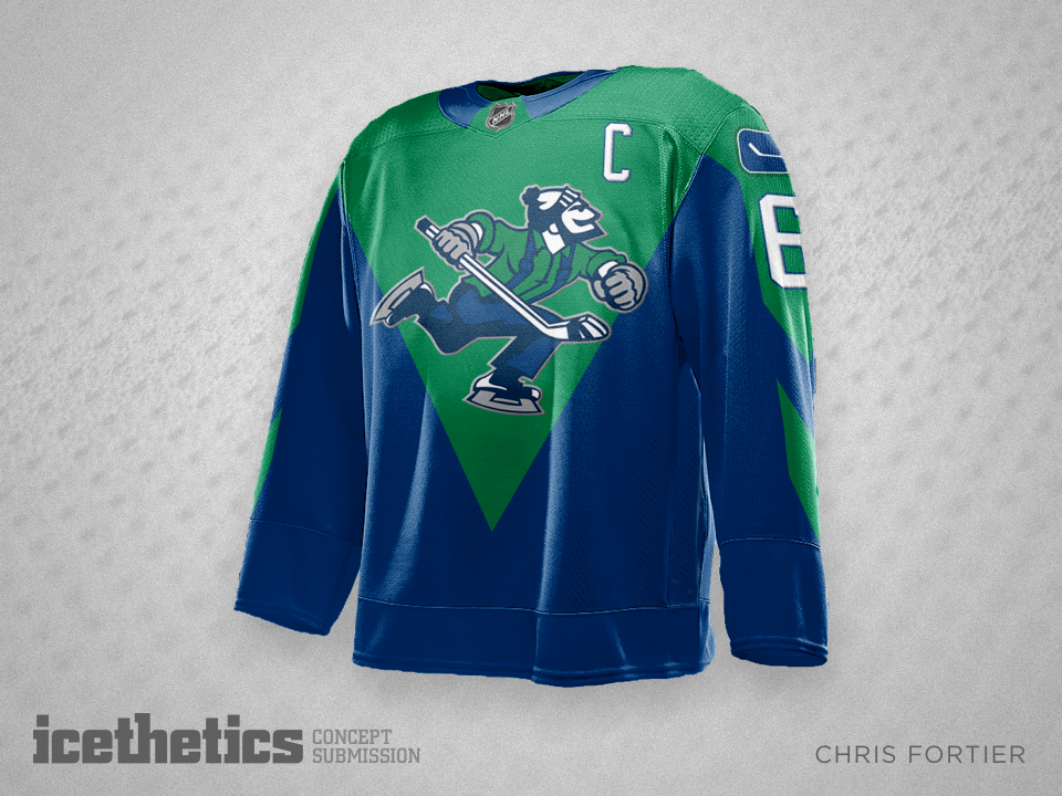
What will the Canucks look like when Adidas takes over production of NHL uniforms next summer? Chris Fortier is hoping for something like this.
For a while I'm turning Sundays over to Las Vegas here on the Concepts page. Lots of cool designs are coming in, including this one from Chris Fortier. The logos are interesting, but I can't say I'm wild about the return of those bland old Penguins colors. This is Vegas!
Next season will be the last of the Reebok Edge era. In 2017, Adidas takes over. That's got Chris Fortier thinking about the future. He writes: "I've always hated the Kings' 'home plate' shield so hopefully I made it more shield-like. I also like the old school crown too so I added that."
When the St. Louis Blues unveiled their logos and uniforms in 1966, the designs looked nothing like what the team ended up wearing during their inaugural season in 1967-68. We know about the jerseys from photos, but recently the white one surface.
It's a cool story and it got concept artist Chris Fortier thinking about the club's upcoming 50th anniversary season. How great would it be if the team did finally wear these?