0082: Sealing Up California Week
/

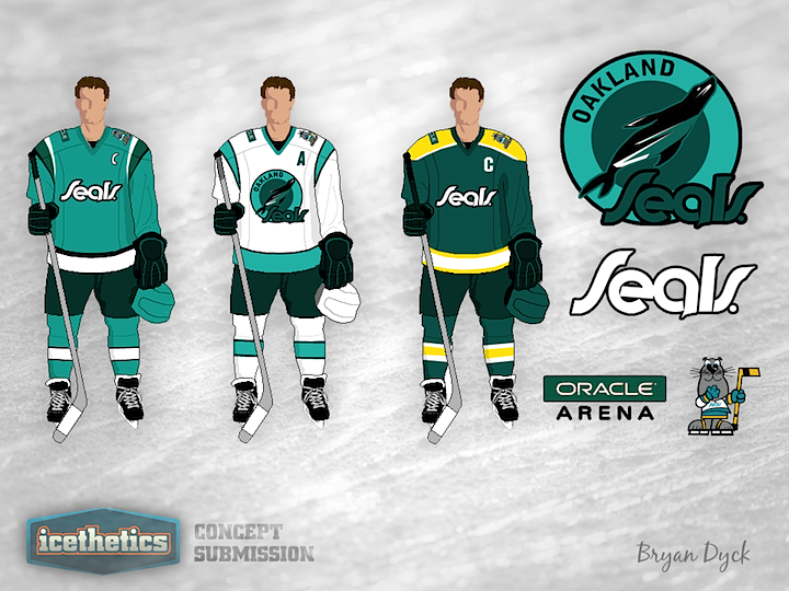
I know what you were thinking. California Week lasts four days but there are only three NHL teams in California. Means we have to double-up on somebody right? Wrong! As you can see, Bryan Dyck has a modernized Oakland Seals uniform concept. There's not enough contrast in his primary logo so it's hard to make out on the white jersey, but that's my only issue with this set. Otherwise, I kind of like it.

