0561: Nevermind the Early Release

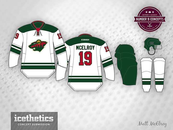
Well, we're not going to let some early release rain on our parade, are we? The Wild's new road jersey showed up in official photos on their website late last night, but that won't keep me from showing some concepts anyway. Like this one from Matt McElroy, who came the closest to getting it right. Nobody planned for the squared off shoulder yoke though.

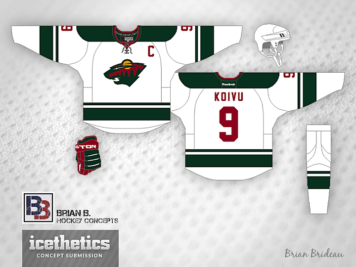
Brian Brideau has a habit of being right about these things and he too came pretty darn close. I like his take on the unlayered, solid color numbers. Gives the jersey that old-timey feel.

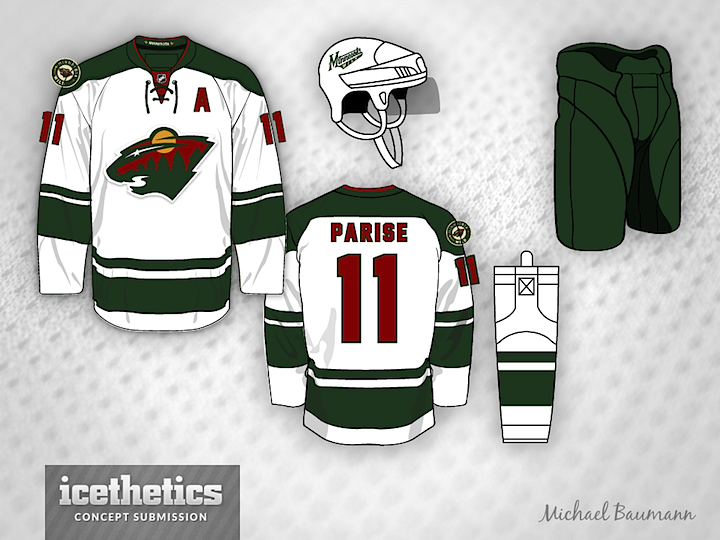
And Michael Baumann, well he's been here before. He submitted a concept back in January awfully similar to this. Talk about psychic, right? All three of these concepts were submitted prior to last night's reveal so they're all legitimate guesses.

No offense to these talented guys, but I'm mighty impressed with what Minnesota actually came out with. I don't think it needs to be improved upon. You?

0558: A Pair of Sabres Predictions

It's Thursday so we're likely to get another "sneak glimpse" of the Buffalo Sabres' new third jersey. In that spirit, how about a pair of predictions? Jeremy Roney thinks he has a pretty good idea of the final product. Think he's on the right track?

Then we have another guess from the prolific Brian Brideau. To see how much his prediction has changed in five weeks, check out this post from last month.

0549: The Next Wave

If yesterday's teasers are to be trusted, the San Jose Sharks will unveil their new home and road jerseys today! So while we wait, a couple of concept artists have produced their take on what we might expect based on the three teaser images the Sharks released.

First up is Justin Wiltron, who is probably very close. I'm not so sure the white will extend all the way down, but other than that, he could be on the money. It's a nice, simplified look that would work well for the Sharks.

Brian Brideau has essentially the same thing, except for — I think — a more accurate waist striping pattern. But as for the sleeve stripes, I think it was clear from the first teaser they aren't diagonal. Then again, it's hard to say for certain.

Looking forward to seeing what we actually get — and how close our concept artists got!

0535: Bringing Back Brooklyn

Today, Brian Brideau presents an alternate jersey for the New York Islanders — featuring the wordmark crest used during the 1941-42 season by the Brooklyn Americans.

And not for nothing, but it seems the NHL is already cashing in on that wordmark. The t-shirt above was spotted at the NHL Store in New York City by Brandon Holmes.

0527: Storm of Red

Let's look at a couple of Carolina Hurricanes concepts today. Braden Humphrey is on to something interesting here. It's not that I think the Canes should encroach on Habs territory, but as an off-the-wall idea, I like this design.

Brian Brideau seems to more on a mission to fix what the team unveiled as their new look back in June. I'm kind of with him. Apart from the font, I think this would be a great solution.

This other design by Brian was created prior to the unveiling as a sort of prediction. And even it's better than the dull design they actually ended up with. Just my opinion, though. I'm sure you have one as well. Let's have it.