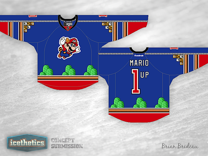
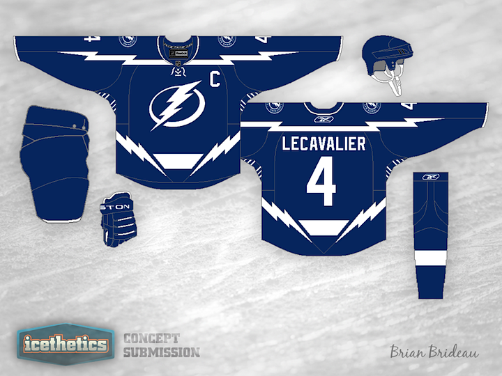
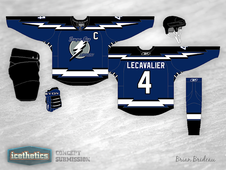
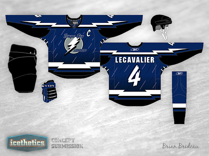
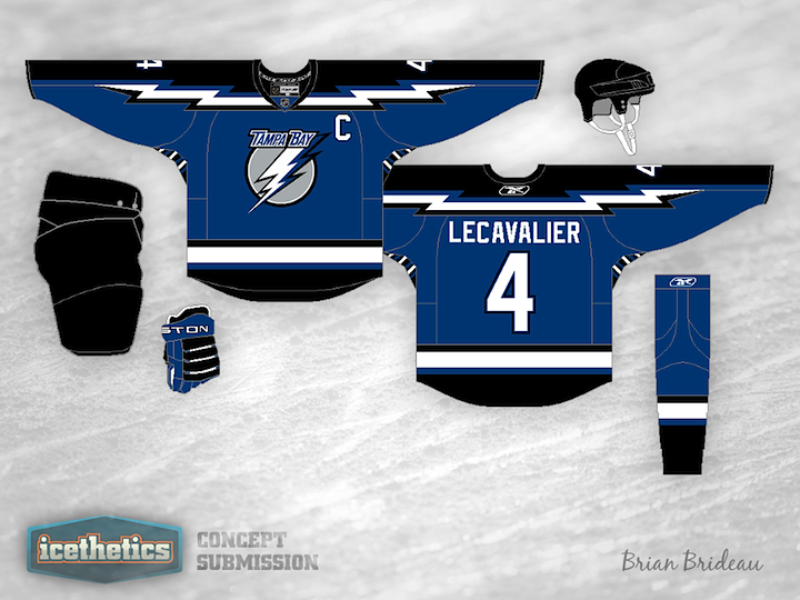
0264: Mario Meets Hockey (Again)

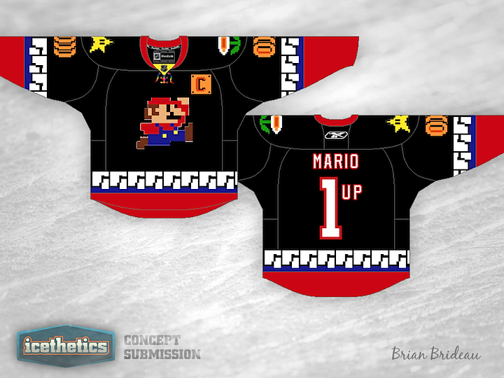
Last time I did this No Hockey Week, the Freak Out Friday post featured Super Mario of video game fame. He's back this time a day early as designer Brian Brideau had a couple more ideas worth sharing. Definitely a creative mind at work here.

0234: Jet Blues

Brian Brideau shares his two-tone blue Jets jersey today. It's a cool look but I'm not sure I'm a fan of the stenciled numbers and letters. (And I know, more blue. Hockey fans seem to like a lot of blue.)

0221: Stars of Texas

Don't expect the Dallas Stars concepts to slow down anytime soon. It's almost all I'm seeing. With a rebrand in the works for 2013, everyone's throwing their hat in the ring. Here, Brian Brideau suggests a color palette more in line with that of the team's home state of Texas. Is red, white and blue the way to go? Or do we already have too much of it in the NHL?

0164: Give It More Electricity!

I can't explain it, but today feels like a Tampa Bay Lightning kind of day. And ever prolific, Brian Brideau has been working on a few different ideas. I'm sharing not one, not two, but three of them with you today!

Same idea for two different eras of Lightning hockey. And this last one is here just because I think it's too funny.

0131: Beantown Bees

Bees. First thing I thought of when I saw this Bruins jersey by Brian Brideau. But as I keep looking at it, I can't help but like it. I realized that it's unlike any other jersey in the NHL because of one thing. There isn't a speck of white on it. Every other NHL jersey either has white or some variation (silver or something cream-like). It's true. Now, there's nothing wrong with white, I just think it might be something to see a jersey without it.