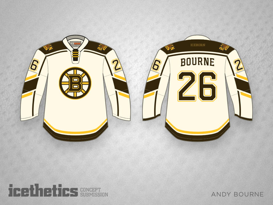
Bruin Brown
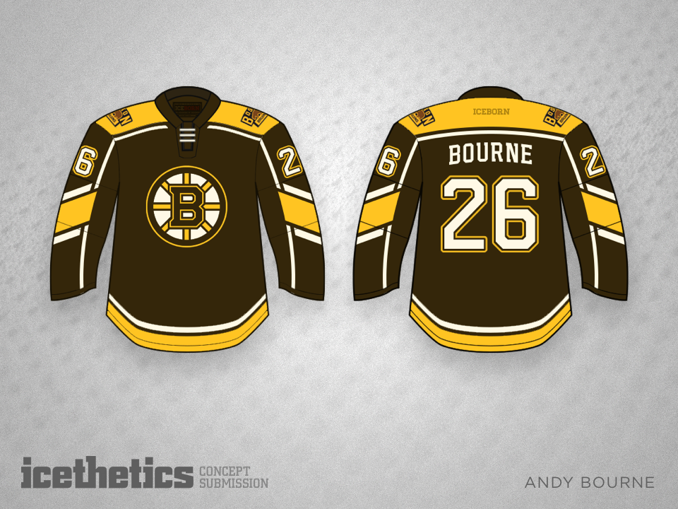
/The Bruins have been black and gold for a long time, but shouldn't they return to their roots? Brown and gold would be a welcome sight, just as it is in this set by Andy Bourne.
The Bruins have been black and gold for a long time, but shouldn't they return to their roots? Brown and gold would be a welcome sight, just as it is in this set by Andy Bourne.
It's difficult to improve on the St. Louis Blues jerseys after they basically perfected them this season. But Andrew Bourne is trying anyway. What do you think? Better, worse or same?
Andrew Bourne is back on Icethetics once again, this time with his take on the defunct Cleveland Barons. I say bring them back and put them in these jerseys! Great look!
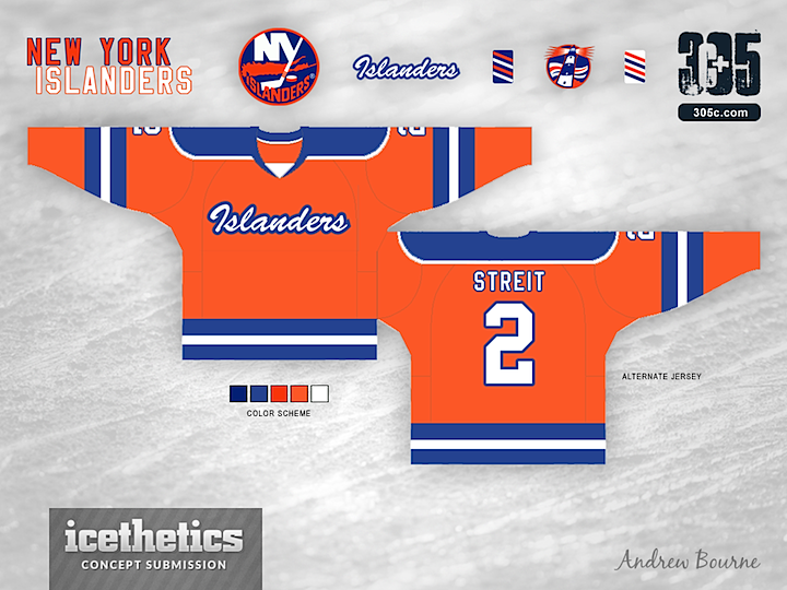
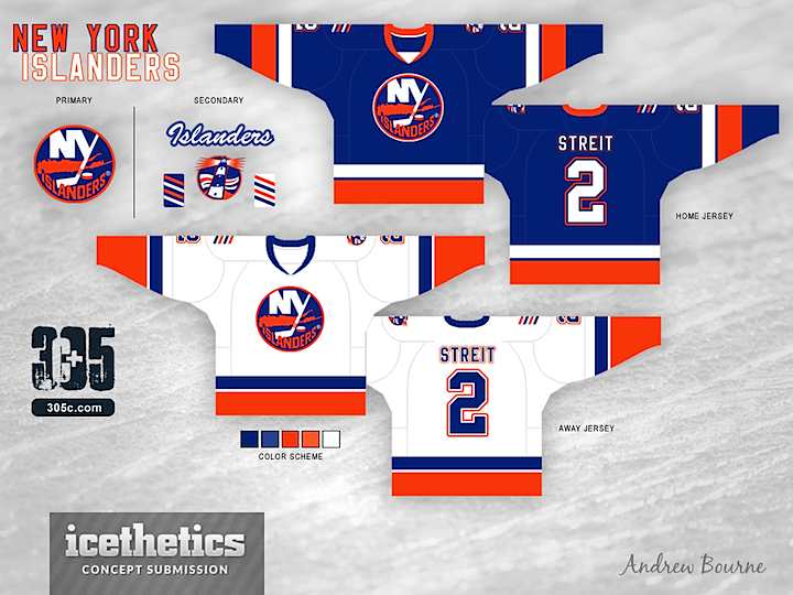
We're close to wrapping up the Re-Bourne series. The Islanders are the 19th team that Andrew Bourne has taken on since he started with the Ducks back in July. I doubt he'll do all 30 NHL clubs, but it's certainly been an interesting ride. What do you think of this set?
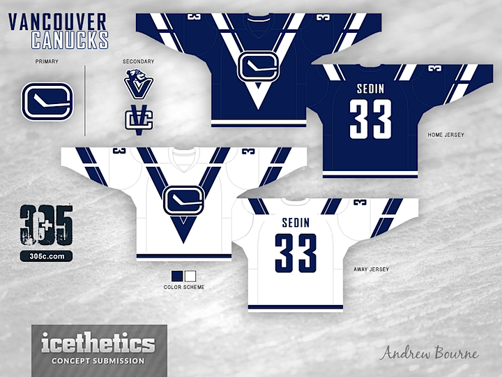
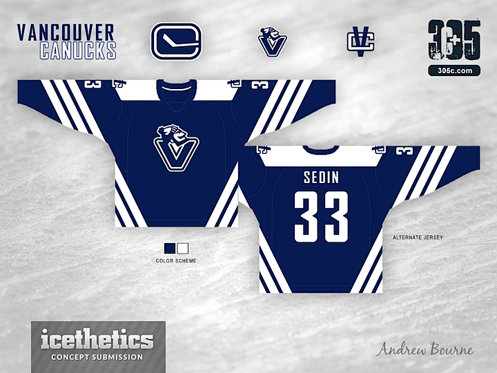
Today we have the next installment in Andrew Bourne's NHL makeover series. Here he tackles the Vancouver Canucks but he's done my least favorite thing — he dropped the green.
This was hard because I really love the jersey set and color scheme put in place by the current owners but also really love the old V uniforms that Vancouver used in 80's. So, instead of just mailing it in, I pushed myself to push The Canucks design to the edge of Seizure-Town.
Right away, I condensed the color scheme to two colors. A lot of V's and a lot of colors with make you want to puke. The large striping appears to be cut or broken up to really show that V in the body of the uniform. With that break, you can really see the V and the C work together. The alternate jersey already has a V on the chest so, I made some angled striping along the sleeves and body of the jersey. Why 3 stripes, you ask? Three trips to the Stanley Cup Finals. Would the stripes actually look good on the ice? I'm not sure, but it looks interesting enough on paper - er... computer screen.