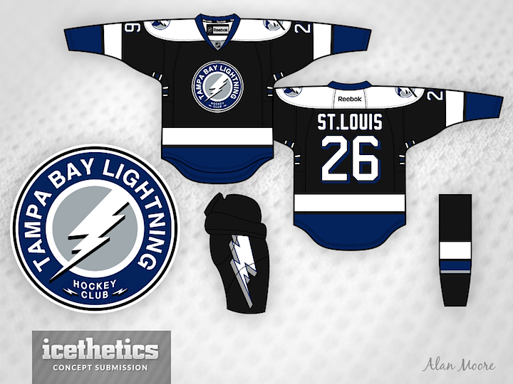
0663: Tampa Bay Fauxback

Alan Moore has merged the Lightning's current look with its original one. Here's his explanation:
Here's a Lightning alternate concept. It's more of a logo concept than a jersey concept, as the jersey is almost identical to their pre-Edge look. I do like their current home and away, but I think the alternate is out of place now.
I modified their existing secondary logo to look more like their original primary mark, adding a silver background and using the shape of the original bolt but with a more modest drop shadow. Sort of a fauxback idea.
I also applied a blue drop shadow to their existing number font. It's intended to be a throwback to their first season look.